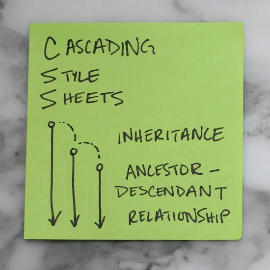
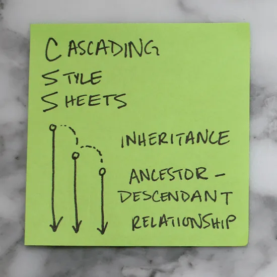
- Cascading Style Sheets Operate on Inheritance
CSS has a ancestor-descendant relationships. Anything previously defined by an ancestor will automatically be inherited by one of its children unless otherwise specified.
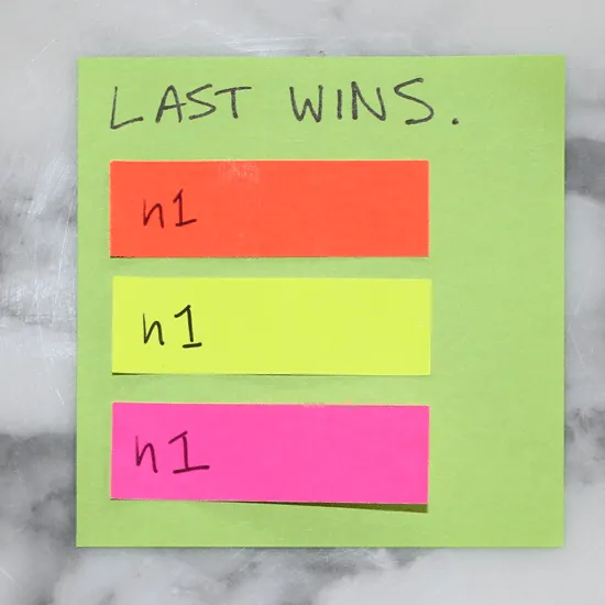
2. Last Wins
If an element is defined in more than one place within CSS, the last definition overrides the previous. (If these stickies represented colors we styled our h1’s, the h1 would appear pink.)
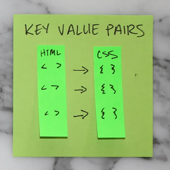
3. Key Value Pairs
For every HTML element to be styled, a corresponding CSS selector must be assigned. They always appear in key value pairs.
4. Layout
Websites can be broken down into components or divs for layouts. It is helpful to conceptualize the overall structure of a website before writing HTML or CSS.
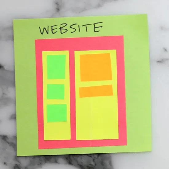
5. Tree Structure
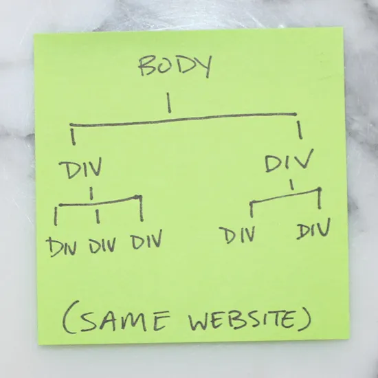
Likewise, structuring a site also follows the tree methodology. This sticky illustrates the one above in tree-branch form.
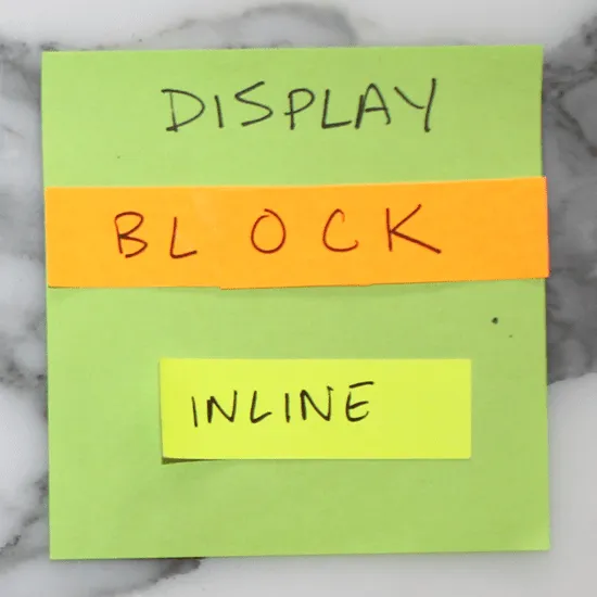
6. Block vs. Inline
Elements that stretch across the full width of a page are block elements. A few block elements include headers, footers, headings (h1, h2, h3, etc.), divs, paragraphs (p). Inline elements only take up as much room as they need to; span, links (a), and images are a few examples.
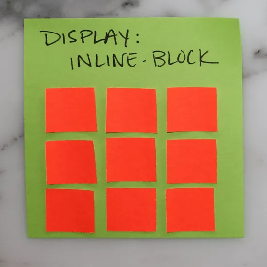
7. Inline-block
There is also such a thing as setting display: inline-block to create a uniform grid. Inline-block elements can have a height and width.
8. Box Model
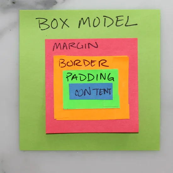
All CSS elements are based on this model. The innermost box is content (could be anything), immediately surrounding content is its padding, then border, and finally, the outermost box–margin.
9. Margins Outside
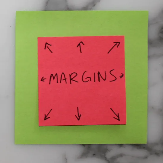
Margins push out around an element. Margins are considered to be outside of the element, and margins of adjacent items will overlap.
10. Padding Inside
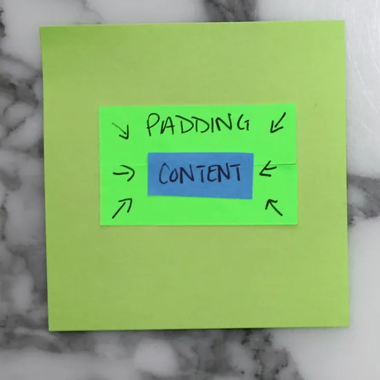
Padding pushes inward on content. Use padding to move the contents away from the edges of the block.
11. Auto Margins
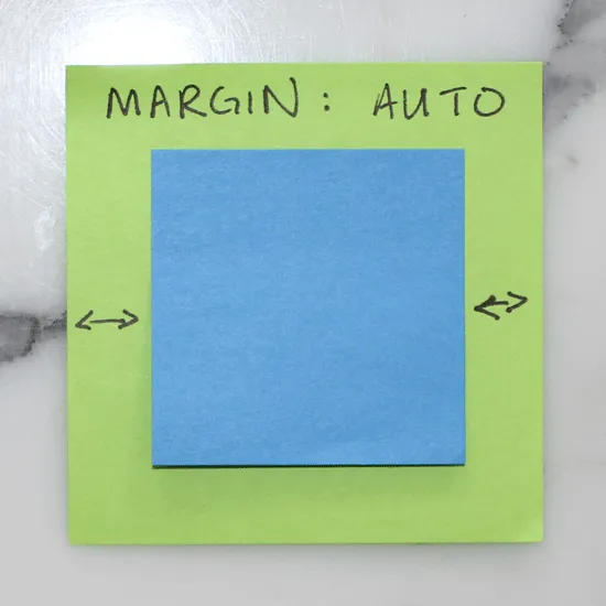
Setting margins to auto for right & left is a handy way of centering.
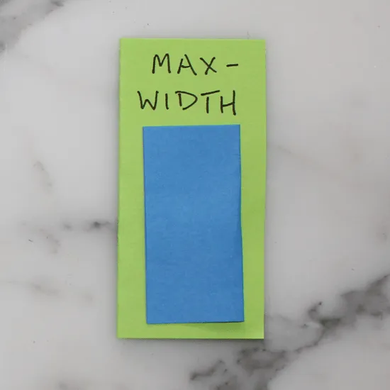
12. Max-width
Max-width prevents the value of the width property from becoming larger than max-width. This is especially helpful when designing for smaller screens (like mobile!)
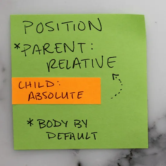
13. Relative and Absolute
Set a parent element to position: relative and its child to position: absolute to position the child within (or relative) to its parent. Note that the parent is always body by default.
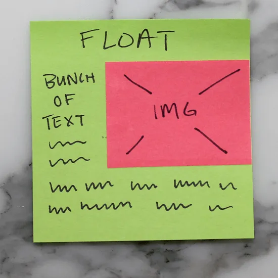
14. Float
Setting an element to float, like the img below for example, will allow the text to flow around it.
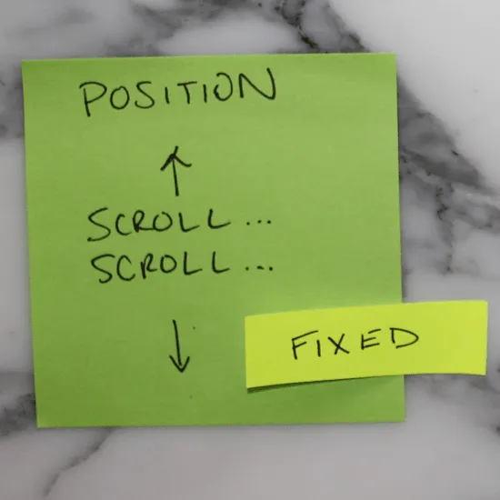
15. Fixed
Fixed elements are exactly that, they are always fixed to the same spot, regardless of page position (scroll).
16. Link up your style sheet!
If you don’t link your style sheet in the header of your HTML, your website will be sad, and probably unattractive. ?
Why the Post-it format works for learning CSS
Three reasons the 16-sticky format teaches CSS better than a 30-page tutorial:
1. Each sticky is a single concept. No paragraph can hide. If the concept doesn't fit on a 3×3 square, the writer didn't understand it well enough yet. Forcing yourself to compress an idea to that footprint is the best test of whether you've actually grasped it.
2. The visual primitive matches the mental model. CSS is a system of boxes containing other boxes. A sticky note is a box. When you draw the box model on a sticky, the sticky itself becomes a real-world demonstration of the principle. The medium is the lesson.
3. The set is finite. Sixteen stickies is all of beginner CSS. Once you've internalized these, you've crossed the cliff. The rest of CSS is composition — specificity rules, media queries, Flexbox, Grid — but it all sits on top of these primitives. Junior devs who can recite all 16 in their own words write better CSS than seniors who can't.
The two stickies most people skip
Reviewing this set years later, the two stickies students underrate at first are #8 (Box Model) and #10 (Padding Inside). They sound obvious. They aren't.
Most CSS bugs reported by junior devs trace back to a misread of the box model — margin where padding was meant, padding where margin was meant, an extra 8px coming from somewhere they can't find. Knowing the box model and being able to draw it from memory prevents 60% of those reports. Spend extra time on stickies 8, 9, and 10. They're the load-bearing ones.
What I'd add today
Modern CSS (Flexbox, Grid, container queries, custom properties, clamp(), min(), max()) deserves its own sticky set. Maybe a future post. The 16 stickies above still teach the foundation — every modern CSS feature inherits from these primitives. Learn the primitives first, the conveniences second.
Gratitude beat
Thanks to every front-end dev who let me sketch on a stack of stickies in a coffee shop to explain a CSS bug. The format started as a debugging hack and turned into a teaching aid. Thank you for being a willing audience.