 Notebook · 07 parts
 Project Management Fundamentals
The fundamentals — scheduling, stakeholders, quality, procurement, integration, working with small projects.
The fundamentals series. Five pieces — terminology, methodology, the iron triangle, stakeholders, and root-cause analysis — written for working PMs.
 Part 01 of 07
 Project, Program, Product, Portfolio Management — a guide
Unlocking Business Success: Understanding Project, Program, Product, and Portfolio Management In today’s fast-paced business world, organizations leverage various management methodologies to …
**Unlocking Business Success: Understanding Project, Program, Product, and Portfolio Management **
In today's fast-paced business world, organizations leverage various management methodologies to achieve their strategic goals. However, the distinctions between project management, program management, product management, and portfolio management are often unclear, leading to confusion and hindering effective execution. This comprehensive guide will demystify these crucial disciplines, defining each role, outlining their responsibilities, and providing real-world examples to illustrate their unique contributions to achieving business objectives.
If you're searching for clarity on these management approaches or looking to optimize your organizational structure, this article will give you the insights needed to succeed.
1. Project Management: Delivering Specific Outcomes with Precision (Examples Included)
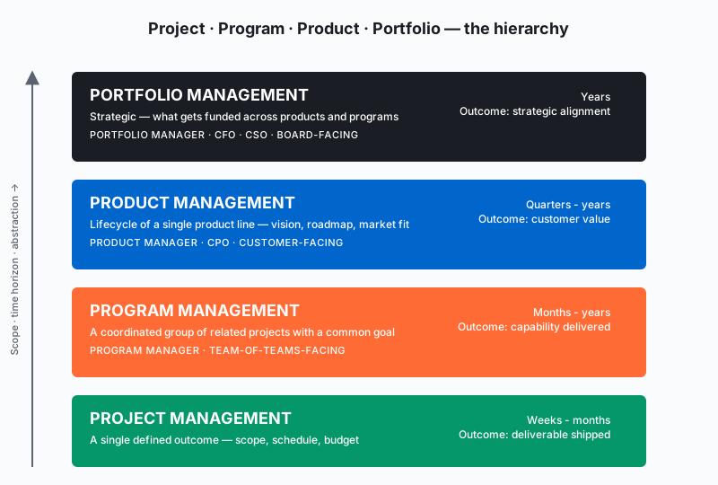
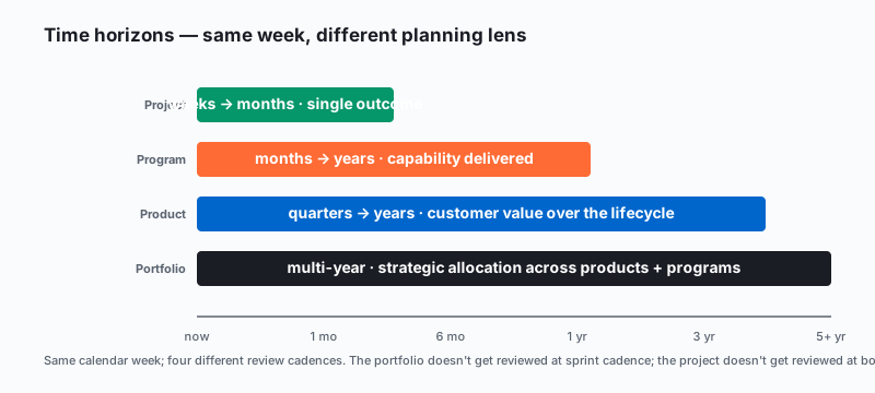
Project management is the discipline of initiating, planning, executing, controlling, and closing the work of a team to achieve specific goals and meet specific success criteria at the specified time. It’s about delivering a unique, temporary endeavor with a defined scope, timeline, budget, and resources. Project managers are the tactical leaders who ensure projects are completed successfully.
Responsibilities of a Project Manager:
On-Time, On-Budget Delivery: Ensuring the project meets its objectives, delivering the desired outcomes within the allocated time and budget.
Resource Management: Effectively managing day-to-day tasks, coordinating team efforts, and allocating resources for optimal project execution.
Risk Mitigation: Proactively identifying, assessing, and mitigating potential risks that could derail the project.
Stakeholder Communication: Maintaining clear and consistent communication with stakeholders, keeping them informed and engaged throughout the project lifecycle.
Project Scope Management: Ensuring that the scope is clearly defined and agreed upon, and managing any scope creep.
Examples of Projects:
Developing a new mobile application
Implementing a new CRM system
Organizing a marketing conference
Constructing a new office building
Key Characteristic: Projects have a definitive start and end, with success measured by achieving predefined goals within the established constraints (time, budget, scope, quality). Project Management Tools like Asana, Trello, and Jira are often used to aid in these efforts.
2. Program Management: Orchestrating Strategic Initiatives Through Related Projects (With Examples)
Program management takes a strategic approach by coordinating and overseeing a group of related projects that collectively contribute to a larger, overarching business objective. Program managers act as conductors, ensuring all projects within the program are aligned and contribute to the shared strategic goal.
Responsibilities of a Program Manager:
Strategic Alignment: Ensuring individual projects within the program align with the overall program objectives and the organization’s strategic vision.
Resource Optimization: Strategically managing and allocating resources across multiple projects, maximizing efficiency and minimizing conflicts.
Dependency Management: Identifying and managing interdependencies between projects to prevent bottlenecks and ensure seamless execution.
Benefits Realization: Tracking, measuring, and ensuring the program delivers the anticipated benefits and value to the organization.
Examples of Programs:
Implementing a company-wide digital transformation initiative (which may include projects like website redesign, new software implementation, and employee training)
Developing a new product line (including market research, product design, and launch projects)
Expanding into a new geographic market (involving market analysis, legal setup, and marketing campaign projects)
Key Characteristic: Programs have a longer time horizon than projects, focusing on achieving strategic outcomes through a coordinated set of interdependent projects.
3. Product Management: Driving Product Success from Concept to Market (Real-World Examples)
Product management is a strategic organizational function that guides every step of a product’s lifecycle—from development to positioning and pricing—by focusing on the product and its customers first and foremost. Product managers are the voice of the customer and the champions of the product, responsible for its overall success.
Responsibilities of a Product Manager:
Market Research & Customer Analysis: Understanding customer needs, pain points, market trends, and the competitive landscape to identify opportunities for product innovation.
Product Strategy & Vision: Defining the “what” and “why” of the product, articulating its value proposition, and developing a clear product roadmap.
Feature Prioritization & Development: Guiding the product development process, prioritizing features, and collaborating with engineering teams to deliver a successful product that meets customer needs.
Go-to-Market Strategy & Launch: Developing and executing comprehensive launch plans, driving product adoption, and monitoring product performance in the market.
Examples of Products:
A software application like Slack or Microsoft Office
A physical product like a smartphone or a car
A service like an online streaming platform or a ride-sharing app
Key Characteristic: Product managers are laser-focused on delivering value to customers and ensuring the long-term success of the product in the market, often using frameworks like Agile and Scrum.
4. Portfolio Management: Aligning Investments with Strategic Goals (Illustrative Examples)
Portfolio management provides the highest level of strategic oversight, encompassing all programs, projects, and other related work within an organization. Portfolio managers are the strategic architects, ensuring that the organization’s investments are aligned with its long-term goals.
Responsibilities of a Portfolio Manager:
Strategic Alignment: Ensuring that all initiatives within the portfolio are aligned with the organization’s overarching strategic objectives and priorities.
Investment Optimization: Prioritizing and allocating resources across the portfolio to maximize return on investment (ROI) and strategic value.
Risk Management: Assessing and managing risks at the portfolio level, ensuring that the organization’s investments are aligned with its risk appetite.
Performance Monitoring & Reporting: Tracking the overall performance of the portfolio, identifying areas for improvement, and making adjustments to ensure alignment with strategic goals.
Examples of Portfolios:
An IT portfolio that includes all IT-related projects and programs
An R&D portfolio that includes all research and development initiatives
A capital investment portfolio that includes all major capital expenditures
Key Characteristic: Portfolio managers have a holistic view of the organization’s investments, ensuring they are aligned with the long-term strategic vision and deliver maximum value. They use portfolio management software to aid in decision making.
A Comparative Table: Project vs. Program vs. Product vs. Portfolio Management
| Feature | Project Management | Program Management | Product Management | Portfolio Management |
|---|---|---|---|---|
| Keywords | Project Manager, Project Scope, Project Lifecycle, Project Delivery, WBS, Gantt Chart | Program Manager, Program Benefits, Program Roadmap | Product Manager, Product Roadmap, Product Lifecycle, Agile, Scrum, MVP, User Stories | Portfolio Manager, Portfolio Optimization, Resource Allocation, ROI |
| Scope | Single, defined project | Group of related projects | Specific product or service | All projects, programs, and other work within the organization |
| Focus | Tactical execution, on-time & on-budget delivery | Strategic coordination, benefits realization | Customer needs, product success, market fit | Strategic alignment, ROI maximization, value delivery |
| Timeline | Defined start and end dates | Longer term, spanning multiple projects | Product lifecycle (ongoing) | Long-term, strategic (ongoing) |
| Objectives | Specific project goals | Broader program objectives | Product success metrics (e.g., adoption, revenue, customer satisfaction) | Organizational strategic goals, business objectives |
| Key Metrics | On-time, on-budget, within scope delivery | Benefits delivered by the program | User engagement, customer satisfaction, revenue, market share | Portfolio ROI, alignment with strategic objectives, overall portfolio performance |
| Decision Making | Project-level, tactical | Program-level, strategic | Product-centric, market-driven | Portfolio-level, strategic |
Differences between Project Management, Product Management, Program Management, Portfolio Management
Conclusion: Mastering These Management Disciplines for Organizational Excellence
Project, program, product, and portfolio management are distinct yet interconnected disciplines that are essential for achieving organizational excellence. By understanding their unique roles, responsibilities, and interdependencies, businesses can:
Improve Strategic Alignment: Ensure all initiatives contribute to the overall strategic vision.
Optimize Resource Allocation: Maximize the impact of investments by strategically allocating resources.
Enhance Project and Program Execution: Deliver projects and programs effectively and efficiently.
Drive Product Innovation and Success: Develop and deliver products that meet customer needs and drive market success.
Achieve Sustainable Growth: Build a portfolio of successful initiatives that deliver long-term value.
In today’s competitive landscape, mastering these management disciplines is no longer optional—it’s a strategic imperative. By embracing and leveraging the power of each, organizations can unlock their full potential and achieve sustainable success. These practices are critical for any business looking to thrive in the modern economy.
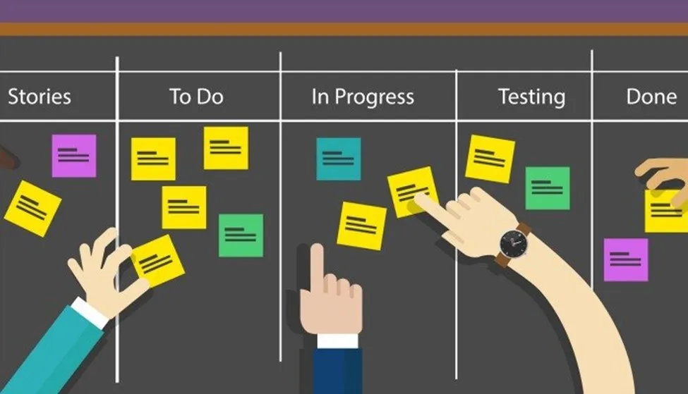 Part 02 of 07
 Waterfall vs Agile for Innovators & Product Managers
I often get asked the question on which is the superior approach to project management, Waterfall or Agile? That’s a good question but its not the right question. Instead, you should ask̷…
I often get asked the question on which is the superior approach to project management, Waterfall or Agile? That’s a good question but its not the right question. Instead, you should ask…
“Which tool is best for this project?”
It might be Agile, Waterfall, a customized combination of both tools, or something else. Further, Waterfall and Agile and just specific forms of approaches that fit into broader categories that are planned-driven or adaptive.
They are both important tools for innovators and we have choices. I often hear Agile practitioners talk about the evils of more planned methodologies, like Waterfall and Stage-Gate. Like most things, these areas are not so black and white and the nuances are important.
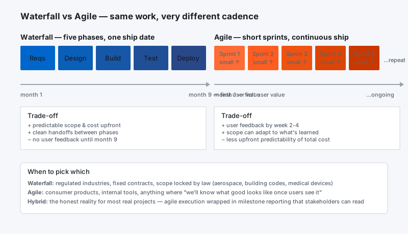
In this article I am going to cover the following.
~~How to compare Waterfall and Agile approaches,
~~The problems Agile project management strives to solve,
~~Why both planned and adaptive approaches need to be used, and
~~Common issues encountered when adopting Agile project management.
~~Waterfall vs Agile
To start with, Waterfall and Agile are widely misused terms. In a strict sense, Waterfall was developed by Winston Royce in the 1970s. It means a Phase-gate approach with approvals between phases. In today’s world when people say Waterfall, the word is used loosely and generally it means anything that’s plan-driven and not Agile. The term “Agile” also has many different meanings to different people. Many people talk about Agile as if it were a specific methodology. For example, Scrum is very widely used and when people say Agile they typically mean Scrum. So the word Agile has some broad meanings as well. Many people see the choice between plan-driven and Agile as mutually exclusive and that’s not accurate. It’s more like a continuous spectrum of alternatives from heavily plan-driven at one extreme to heavily adaptive at the other extreme. It’s more a matter of fitting the methodology to the project and to the business rather than force-fitting a project and a business to one of those extremes.
~~Plan-driven Approaches
A plan-driven approach works in situations that have low levels of uncertainty, like building a bridge across a river. If you have a situation that is relatively straight-forward, it’s well-defined, it’s repeatable, a plan-driven approach is a good choice as you can take the lessons you’ve learned on one project and do better on the next project because it’s similar and follows the same model.
~~Agile
Agile works best in environments with high levels of uncertainty. An example is finding a cure for cancer. If you were to develop a project plan for finding a cure for cancer, it would be ridiculous to try to develop a detailed plan with schedule and cost information. There’s just too much uncertainty. It’s a wasted effort to try to develop a detailed plan. In that kind of situation, people are more concerned about the goal of finding a cure for cancer than they are about having a detailed cost and schedule breakdown of what it’s going to take to get there. It’s based on an empirical process control model. The word empirical means based on observation, meaning that as you go through the project, you’re continuously adjusting both the product and the process to complete the product.
~~Is Agile Better?
No, it's not. Saying Agile is better than Waterfall is like saying a car is better than a boat. They are two different things, and each has advantages or disadvantages based on the environment that you're in. So Agile is not inherently good and Waterfall is not inherently bad. It's more a matter of fitting the right approach to the right problem.
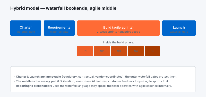
~~Moving to Agile
There’s a lot of companies that just want to jump on the Agile bandwagon and many times it’s a superficial kind of thing. It might be just a brute-force approach to get it done because they see it as a way of getting products to market quicker and they wind up working people overtime and weekends to get things done quicker, and call that Agile. That’s not the right approach, obviously. Agile is heavily dependent on training and coaching to do it right. You can’t just take a cookbook approach like Waterfall and do step 1, 2, 3, 4, etc. It really requires some good intelligence among everyone on the team–developers, Scrum masters, etc. Everyone has to be intelligent enough to figure out how to do things and adapt the process and the product as they go along, so it requires a lot more skill. At a corporate level, it could require some corporate change, because there’s significant cultural changes that may be required. Agile requires breaking down walls and barriers and developing more of a collaboration.
There are issues companies encounter as they try to incorporate Agile practices into their project management. I like to say it’s a journey, not a destination. There’s an on-going learning effort and there are stages of learning associated with getting into Agile. It can take years for a complete transformation of a major company. You might start out small, you might start out with just a pilot effort on one or two projects, and expand it.
Let me know your thoughts below.
 Part 03 of 07
 Good, Fast, Cheap — the golden triangle of project management
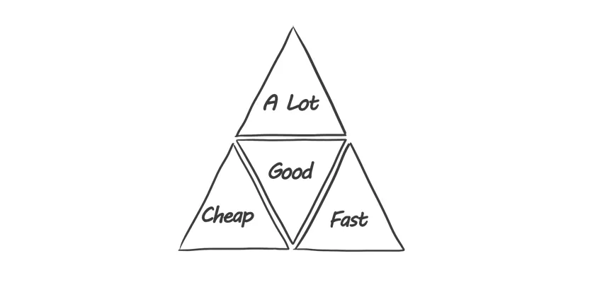
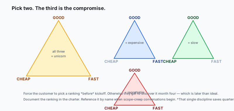
Every project lives inside the same triangle — Good, Fast, Cheap, pick two. Sounds glib. Is actually load-bearing physics for every project decision you'll make this quarter.
There are many ways to describe the boundaries of a project. The simplest is "The Golden Triangle" — three constraints (sometimes drawn as four dimensions) that determine both the limits of the project and the criteria for declaring it a success.
The Golden Triangle demonstrates the basic mathematical relationship between its parts: any increase along one axis forces a corresponding change on another. If scope grows, schedule or budget must grow with it. If you hold schedule fixed and budget fixed, scope must shrink — or quality breaks.
Another approach extends the triangle into a hexagon to include scope, time, budget, quality, risks, and customer satisfaction. Useful as a framing — also useful when the simpler triangle is letting a customer slip out the back door of "but I want all three."
The notional variant nobody can deliver
There is a fourth-corner variant of the triangle that's never actually achievable but is still demanded weekly in real meetings:
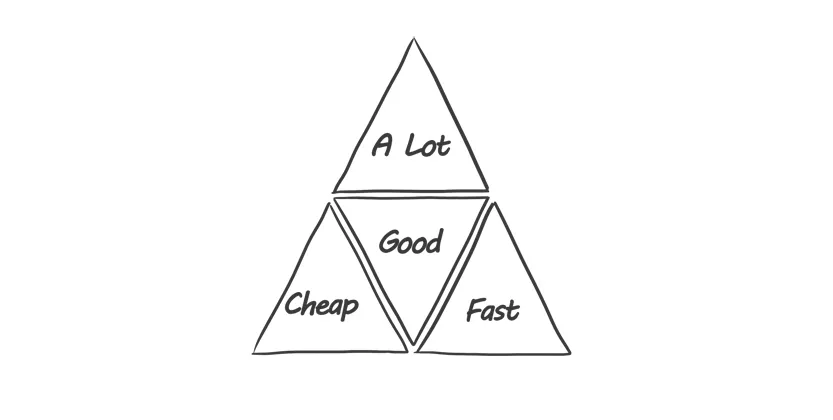
The Golden Triangle of Project Management — pick two, the third is a consequence.
"A Lot — Fast — Cheap — Good" is the set of expectations that can never be achieved simultaneously. It's the result of:
- the customer's (completely understandable) lack of understanding of what the project actually requires
- a lack of trust about the estimates presented at sale time
- the well-documented industry tendency for projects to deviate from original timetable, resources, budget, and scope
Therefore, in order to create a solid basis for the project, its premise must be ambitious but realistic, fully understood, and agreed to by the client up front.
How to actually have the trade-off conversation
The trick is to make the trade visible before the project starts, not in month four when you discover the customer believed all four corners. A few things that work:
1. Force the ranking, not just the menu. Don't ask "which is more important?" Ask "if I told you we could deliver two of these three perfectly, which two would you pick and which one are you willing to compromise on?" The "compromise" word forces a real ranking.
2. Visualize the slider. Draw the triangle on a whiteboard. Put a dot in the middle. Move the dot toward "Fast" and visually show the other two shrinking. Customers feel the trade-off in their gut once they see it move. A spreadsheet doesn't do this.
3. Pre-commit to the trade-off ritual. Write down which corner gets compromised when reality forces a choice, and store it in the project charter. When month four hits and a re-scoping decision is needed, you don't re-debate — you reference the charter.
4. Use the hexagon when needed. If the customer pushes back on "only three dimensions," upgrade to the hexagon (add risks, quality, customer satisfaction). You're not adding complexity — you're acknowledging the complexity that's already there.
What changes once the customer feels it
In honest order:
- The "scope creep" conversation goes from adversarial to mathematical. "If you add this, here's the corner that gives." Math, not feelings.
- Estimates stop being negotiated down. The customer learns that "negotiating" a 3-month estimate to 2 months is just pre-deciding which corner will fail.
- The mid-project trade-offs land softer. The customer already agreed to a ranking. The re-scoping conversation is a calendar event, not a fight.
- Status updates get more useful. "We're on track" becomes "we're on track along the dimensions we agreed mattered most."
Gratitude beat
Thanks to every project sponsor who's been patient with me drawing the triangle on a whiteboard for the fourth time in the same kickoff meeting. You're the reason this conversation gets cheaper over a career. Thank you.
A few real-world variants worth knowing
The "moving deadline" variant. Customer locks budget and scope, then the deadline shifts left by six weeks because of an external event (trade show, regulatory date, competitor announcement). Quality is the corner that gives — even if nobody explicitly said so. Best practice: identify the first dimensions you'll cut on quality (testing depth? documentation? performance polish?) before the squeeze hits. Pre-decide, don't crisis-decide.
The "phantom scope" variant. Customer says scope is fixed, but the interpretation of each scope item is fluid. Six weeks in, "user can log in" turned out to mean SSO + 2FA + RBAC + audit logging. The corner that gives here is whichever the customer hasn't been forced to rank yet. Best practice: write acceptance criteria for every scope item at kickoff, not as needed.
The "post-launch quality debt" variant. Customer accepts a quality compromise to hit the date, ships, and then expects free post-launch polish. Be very clear at the trade-off conversation that the compromise is permanent unless re-funded. Otherwise the customer believes they got all four corners; you just delivered them in two phases.
The single move that prevents most disasters
Document the trade-off ranking in the project charter, get a signature, and reference it by name whenever a re-scoping conversation starts. Not a clever phrase, no spreadsheet magic. Just the discipline of writing down "if reality forces a choice, time is what we'll compromise on, in this order: scope first, quality second, budget third." Re-read it at sponsor meetings. Re-reference it when the inevitable change request lands.
Most "scope creep" disasters are actually unrecorded-trade-off disasters. The work happened, but nobody wrote down the priorities, so every micro-decision became a re-negotiation. Write it down. Save yourself a quarter.
 Part 04 of 07
 Stakeholder Management: Your Secret Weapon for Success
What is Stakeholder Management? You’re a project, program, or product manager. So, you have a lot on your plate. You’re dealing with deadlines, resources, and many different priorities.…
What is Stakeholder Management?
You’re a project, program, or product manager. So, you have a lot on your plate. You’re dealing with deadlines, resources, and many different priorities. However, there’s one thing that can truly determine your success. That thing is stakeholder management. In today’s world, managing stakeholders well is a must-have skill. It’s your secret weapon.
First, stakeholder management is all about people. It’s about figuring out who cares about your project, program, or product. Then, it’s about understanding them. Finally, it’s about engaging with them effectively. These people, or stakeholders, can be inside your company. For example, they might be your team or your boss. Also, they can be outside your company. For instance, they could be customers, partners, or even regulators.
Why Does it Matter to You?
Think of stakeholder management as a bridge. It connects your project to its success. Here’s why it’s so important:
Fewer Risks: You can understand what stakeholders need early on. As a result, you can spot and solve problems before they grow.
More Support: When stakeholders are involved, they’re more likely to support you. They’ll give you resources and help you.
Better Decisions: Stakeholders have different views. Therefore, listening to them helps you make better choices.
Clearer Communication: A good plan means everyone gets the right information. Consequently, this leads to fewer misunderstandings.
Everyone on the Same Page: It helps ensure all stakeholders and team members share common goals. As a result, this creates a more harmonious work environment.
Higher Success Rates: In the end, good stakeholder management means better results. Your project or product is more likely to succeed.
Real-World Example: The Unhappy Customer
Imagine you’re launching a new software feature. You plan it carefully. But, you forget about a group of important users. These users like the old way of doing things. The new feature messes that up. After the launch, they complain a lot. This could hurt your company’s image.
This shows what happens when you don’t manage stakeholders well. What if you talked to these users earlier? Then, you could have changed the feature. Or, at least, you could have been ready to handle their complaints.
Simple Steps for Great Stakeholder Management:
1. Find and Understand Your Stakeholders:
Brainstorm: First, make a list of everyone who might care about your project.
Power/Interest Matrix: Next, figure out how much power and interest each stakeholder has. This helps you know who to focus on.
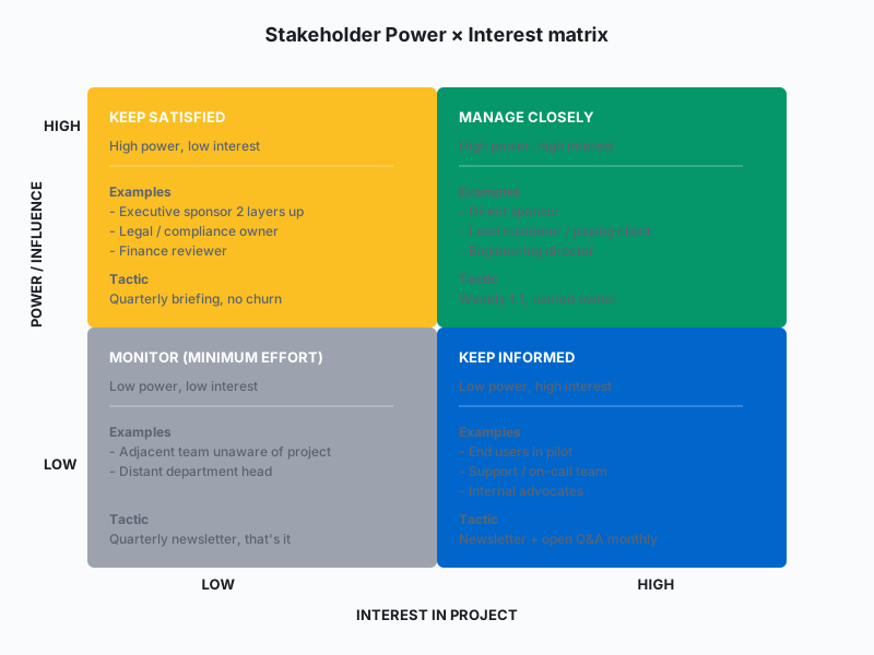
- Stakeholder Register: Finally, make a document about each stakeholder. Include their needs, expectations, and how much influence they have.
2. Make an Engagement Plan:
- Different Strokes for Different Folks: Some stakeholders need more attention than others. So, plan your approach accordingly.
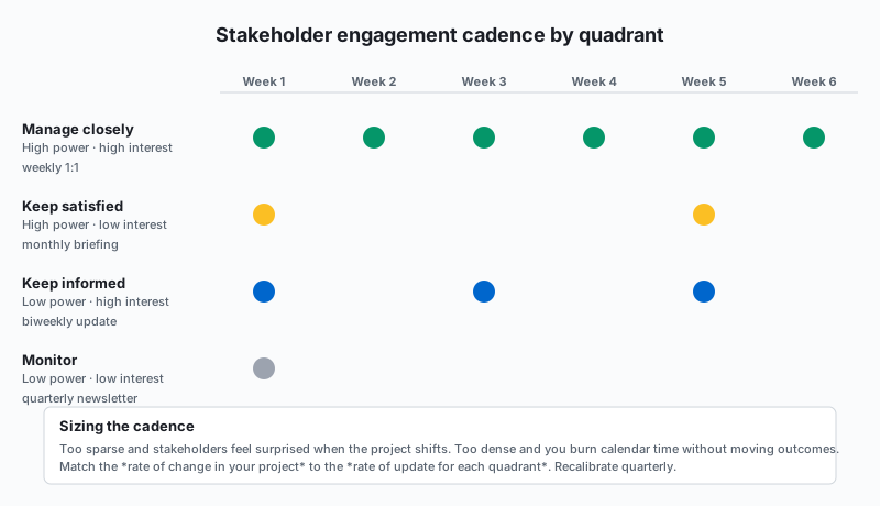
Choose Communication Channels: How will you talk to them? Emails? Meetings? Newsletters? Pick what works best for each stakeholder.
Set Goals: What do you want to achieve with each stakeholder? Decide if you need their feedback, support, or something else.
3. Engage, Communicate, and Influence:
Listen Actively: First, pay attention to what stakeholders say. Show them you care about their opinions.
Be Transparent: Next, be open about the project. Share the good and the bad.
Build Relationships: Also, be reliable and responsive. Build trust with your stakeholders.
Negotiate and Solve Problems: Finally, be ready to talk things out. Find solutions that work for everyone.
4. Monitor and Adjust:
Review Regularly: Check your plan often. Is it working? Do you need to change anything?
Get Feedback: Ask stakeholders how you’re doing. Use their feedback to improve.
Real-World Example: Working Together Across Teams
You’re managing a big system upgrade. It affects many departments. IT, Operations, and Marketing are all key stakeholders.
You use a power/interest matrix. IT has high power and interest. They’re doing the work. Operations has high interest but less power. The upgrade changes their work. Marketing has some interest and power. They need to tell customers about the changes.
You make a plan. It includes regular meetings with IT. You also plan workshops with Operations. Finally, you add bi-weekly updates for Marketing. This keeps everyone in the loop. The result? A smoother upgrade.
Conclusion:
Stakeholder management isn’t one-size-fits-all. Also, it takes effort. It needs flexibility. And, it requires real relationship building. But, when you master this skill, you can handle any project. You’ll build agreement, reduce risks, and drive success. Start working on your stakeholder management strategy today. It’s an investment that will really pay off!
Free Example Stakeholder Engagement Plan
Thanks for reading this far. Please subscribe to this feed and here is a example plan
Project: Implementation of a New Customer Relationship Management (CRM) System
Project Goal: To implement a new CRM system that improves sales efficiency, enhances customer service, and provides better data analytics capabilities.
Stakeholder Engagement Plan
1. Introduction
This plan outlines the strategy for engaging with stakeholders throughout the implementation of the new CRM system. The goal is to ensure all stakeholders are informed, engaged, and supportive of the project, leading to a successful implementation and adoption of the new system.
2. Stakeholder Identification and Analysis
| Stakeholder Group | Key Stakeholders/Roles | Interest Level | Influence Level | Key Concerns/Needs | Communication Needs |
|---|---|---|---|---|---|
| Internal | |||||
| Executive Leadership | CEO, CFO, CIO | High | High | ROI, strategic alignment, minimal business disruption | Monthly progress reports, steering committee meetings |
| Sales Team | Sales Director, Sales Managers, Sales Representatives | High | Medium | Ease of use, improved lead management, accurate sales forecasting | Training, demos, weekly updates |
| Marketing Team | Marketing Director, Marketing Managers | Medium | Medium | Lead quality, campaign tracking, customer segmentation | Bi-weekly meetings, training |
| Customer Service Team | Customer Service Director, Customer Service Reps | High | Medium | Access to customer history, efficient issue resolution, integrated communication tools | Training, demos, weekly updates |
| IT Team | IT Director, System Admins, Developers | High | High | System integration, data migration, security, ongoing maintenance | Daily stand-ups, technical meetings |
| Training Department | Training Manager, Trainers | Medium | Medium | Development of training materials, delivery of training sessions | Bi-weekly meetings, access to the system |
| External | |||||
| Customers (Indirect) | Key Accounts, General Customer Base | Low | Low | Minimal disruption to service, potential improvements in customer experience | Email announcements, website updates |
| CRM Vendor | Account Manager, Technical Support | High | High | Successful implementation, ongoing support contract | Weekly project meetings, as-needed communication |
| regulatory bodies | Data protection and privacy authorities | low | high | data protection and privacy and any industry-specific regulations | Compliance reports as needed |
3. Stakeholder Engagement Matrix
This is similar to the power/interest grid.
| Stakeholder Group | Engagement Strategy | Frequency | Channels | Owner |
|---|---|---|---|---|
| Executive Leadership | Consult and seek approval for key decisions. Keep informed of major milestones and potential risks. | Monthly | Steering committee meetings, executive summaries, email updates | Project Manager |
| Sales Team | Involve in requirements gathering, testing, and training. Provide regular updates and address concerns promptly. | Weekly | Team meetings, email updates, demos, training sessions | Project Manager, Sales Director |
| Marketing Team | Collaborate on lead management and campaign tracking processes. Gather feedback on system usability and functionality. | Bi-weekly | Project meetings, email updates, training sessions | Project Manager, Marketing Director |
| Customer Service Team | Involve in requirements gathering, testing, and training. Address concerns about workflow changes and system integration. | Weekly | Team meetings, email updates, demos, training sessions | Project Manager, Customer Service Director |
| IT Team | Close collaboration on all technical aspects of the project, including data migration, system integration, and security. | Daily/As needed | Daily stand-ups, technical meetings, issue tracking system | Project Manager, IT Director |
| Training Department | Collaborate on the development and delivery of training materials. Provide access to the system for training purposes. | Bi-weekly | Project meetings, access to staging environment | Project Manager, Training Manager |
| Customers (Indirect) | Inform about the upcoming changes and potential benefits. Minimize any disruption to service during the transition. | As needed | Email announcements, website updates, social media posts | Marketing Team |
| CRM Vendor | Regular communication regarding project progress, technical issues, and support requirements. Manage the vendor relationship to ensure project success. | Weekly/As needed | Project meetings, email, phone calls | Project Manager |
| Regulatory Bodies | maintain compliance and keep updated with reports. | As needed | compliance and audit reports | Project Sponsor, Legal Team |
4. Communication Plan
A detailed communication plan will be developed and maintained separately. It will include:
Communication Objectives: What we aim to achieve with each communication.
Key Messages: The core information to be communicated to each stakeholder group.
Communication Methods: The specific channels and tools to be used.
Timeline: A schedule for communication activities.
Responsibility: Who is responsible for each communication task.
5. Risk Management
Potential risks to stakeholder engagement include:
Resistance to change from internal teams.
Lack of buy-in from key stakeholders.
Miscommunication or misunderstandings.
Vendor-related issues (e.g., delays, technical problems).
Mitigation strategies:
Proactive communication and engagement to address concerns and build support.
Clear and transparent decision-making processes.
Regular risk assessments and contingency planning.
Strong vendor management practices.
6. Monitoring and Evaluation
The effectiveness of the stakeholder engagement plan will be monitored through:
Stakeholder Feedback: Surveys, feedback sessions, and informal conversations.
Project Progress: Tracking project milestones and identifying any delays or issues related to stakeholder engagement.
Risk Log: Monitoring and managing identified risks.
The plan will be reviewed and updated at least monthly or more frequently as needed.
7. Project Sponsor Approval
The project sponsor will review and approve this plan.
This stakeholder engagement plan provides a framework for managing stakeholder relationships throughout the CRM implementation project. By implementing this plan, the project team can increase the likelihood of a successful project that meets the needs of all stakeholders. Remember to adapt and modify this template to fit the unique requirements of your own project and stakeholders. Good luck!
 Part 05 of 07
 Mastering Root Cause Analysis with Fishbone Diagrams
Key Highlights Fishbone Diagrams Introduction Root Cause Analaysis In the quest for ongoing improvement, good problem-solving methods are very important. Root cause analysis plays a key role in…
Key Highlights Fishbone Diagrams
This blog is a clear guide on fishbone diagrams. These diagrams are also known as the Ishikawa Diagram.
It explains the basics and gives practical steps for making one.
The blog also shares real-world examples of fishbone diagrams used in different situations. This shows how useful they can be.
When teams use a fishbone diagram well, they can look beyond the symptoms and find the real root causes of problems.
This visual and teamwork method helps in creating better solutions and supports continuous improvement in many industries.
Introduction Root Cause Analaysis
In the quest for ongoing improvement, good problem-solving methods are very important. Root cause analysis plays a key role in this process. It helps us not just fix the obvious problems but also find and address the real reasons behind them. This is where the Fishbone Diagram comes in, also called the Ishikawa Diagram or cause-and-effect diagram. This helpful visual tool guides us in finding potential causes and encourages teamwork in solving problems.
Understanding the Fishbone Diagram for Root Cause Analysis
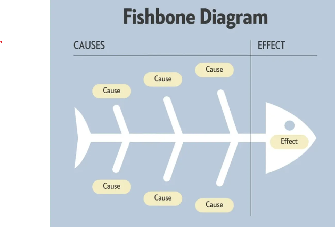
The Fishbone Diagram is also called the Ishikawa Diagram or cause-and-effect diagram. It is a visual tool that helps find possible root causes of a specific problem. The diagram looks like a fish skeleton. The “head” of the fish shows the problem statement, and the “bones” that spread out show different categories of potential causes. By brainstorming and organizing these causes, the diagram helps teams see how the effect (the problem) connects to its potential causes.
The main goal of using a fishbone diagram is to find the most likely root cause of a problem. This process is not always straightforward. It often needs a closer look within each category. The structured design of the diagram allows teams to think about all possible factors. This helps create a better understanding of the root cause of a problem.
The Origins and Evolution of the Fishbone Diagram
The Fishbone Diagram is an important part of quality management. Kaoru Ishikawa, a well-known Japanese professor and quality control expert, created it in the 1960s. It was first used as a quality control tool at Kawasaki shipyards. Soon after, other industries also started using it, and it became known around the world.
Over the years, the main ideas and structure of the fishbone diagram have not changed much, showing how effective it still is. However, the way it is used has changed a lot. It helps improve manufacturing processes and service quality. Its ability to adapt has made it a valuable tool for root cause analysis in many fields.
Additionally, digital tools have made it even more useful. Platforms like KaiNexus let users create, share, and manage Fishbone Diagrams online. This helps teams work together easily and improves problem-solving in today’s fast-paced workplaces.
Key Components and Their Roles in the Analysis
The fishbone diagram has its problem statement at the “head” of the fish. This tells us what problem we are looking at. From the problem statement, there are “bones” that branch out. These represent different categories of causes.
These categories help us think about possible causes. You can change the categories to fit different industries or issues. Common categories include People, Methods, Machines, Materials, Environment, and Measurement. Together, they are often called the 6Ms. Each category helps us focus on factors that might cause the problem.
Arranging potential causes into these categories gives a clear way to analyze them. This makes sure we look at all the different factors. It also helps us find where the root cause might be hiding.
Step-by-Step Guide to Creating a Fishbone Diagram
Creating a Fishbone Diagram is an easy process. It gets everyone involved and helps the team understand the problem better. First, you need to write a clear problem statement. This statement goes at the “head” of the fish and shows what you are trying to find out.
After that, find the main categories of possible causes related to the problem. It is important to pick categories that fully cover the areas that might affect the issue. These could be about people, processes, equipment, or outside factors.
State the Problem – Clearly
At the “head” of the fish (the right side), clearly and concisely write the problem you are investigating. Be specific. Instead of “Problems with the website,” use something like “High Number of Production Errors After Deployments.”
Identify the Categories
The main “bones” branching off the spine represent the major categories of potential causes. In your case, these are People, Process, and Technology.
List the Potential Causes
For each category, list the specific potential causes you’ve identified. These are the smaller bones branching off the category bones. You’ve already provided these in your table.
Analyze and Investigate
Once the diagram is complete, use it as a starting point for brainstorming and investigation. For each potential cause, ask "Why?" Dig deeper to understand the root cause of the problem. For example, if "Lack of Communication" is a cause, ask "Why is there a lack of communication?" This might lead you to discover other underlying issues.
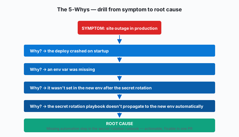
Prioritize and Address
After analyzing the potential causes, prioritize them based on their impact and likelihood. Focus on addressing the root causes that are most likely contributing to the problem.
Practical Applications of Fishbone Diagrams Across Industries
The Fishbone Diagram is very useful in many different industries. You can find it in manufacturing, healthcare, software development, and service sectors. Its principles work well, showing how adaptable it is for root cause analysis in many situations.
In manufacturing, the Fishbone Diagram helps find bottlenecks in production, see causes of defects, or check equipment downtime. In healthcare, it helps looked at safety incidents, figure out what leads to medication errors, or make patient flow better. No matter the industry, the Fishbone Diagram is a helpful tool for spotting and solving the root causes of issues.
Enhancing Manufacturing Efficiency and Reducing Downtime
In the manufacturing industry, being efficient is very important. Fishbone Diagrams are great tools for improving production processes. By using this method, manufacturers can find and fix bottlenecks that slow down productivity.
For example, if a factory often has shutdowns on the production line, a Fishbone Diagram can help. The main problem can be written as “Production Line Downtime.” Then, categories like equipment issues, material shortages, operator mistakes, and environmental factors can help find potential causes.
After figuring out these causes, they can be looked at more closely to find the root cause. This might show that maintenance schedules for equipment aren’t good enough, that material deliveries are late, that operator training is lacking, or that temperature changes affect production. Taking corrective actions based on these insights can improve manufacturing efficiency and reduce costly downtime.
Improving Service Quality in Healthcare Settings
Fishbone Diagrams are very important in managing healthcare quality. They help to find the main reasons behind service quality problems. Whether it’s about patient safety or long wait times, this tool helps to discover what affects patient care.
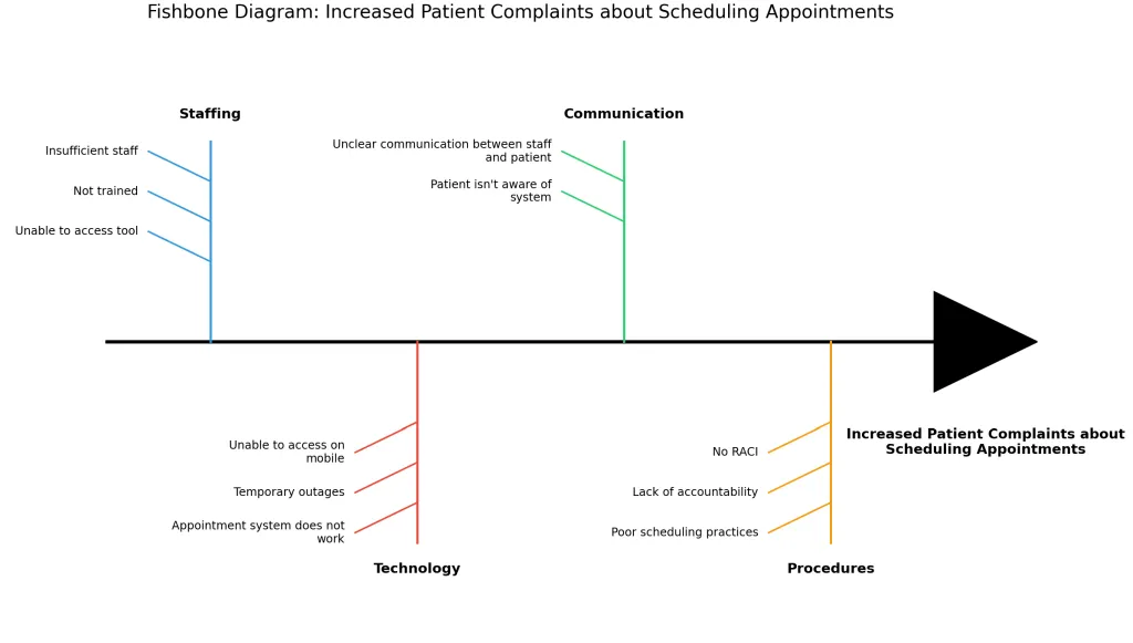
For instance, if a hospital faces more patient complaints about scheduling appointments, a Fishbone Diagram can help analyze this issue. By dividing it into categories like “Staffing,” “Technology,” “Communication,” and “Procedures,” we can better identify potential causes.
Looking deeper into these categories might show that there is not enough staff during busy times. It could also uncover issues like software problems in the appointment system, unclear communication between staff and patients about available slots, or poor scheduling practices. Solving these root causes will improve the service quality for patients and make the healthcare system more efficient.
Real World Examples
Understanding the Fishbone Diagram is important. However, seeing real-world examples makes it easier to understand how to use it. Learning how others have used this tool can give you good ideas and helpful tips for your own situation.
Let’s look at a few examples that show how the Fishbone Diagram can be used to analyze and understand different situations in various scenarios.
Example Fishbone Diagram for a failed website deployment
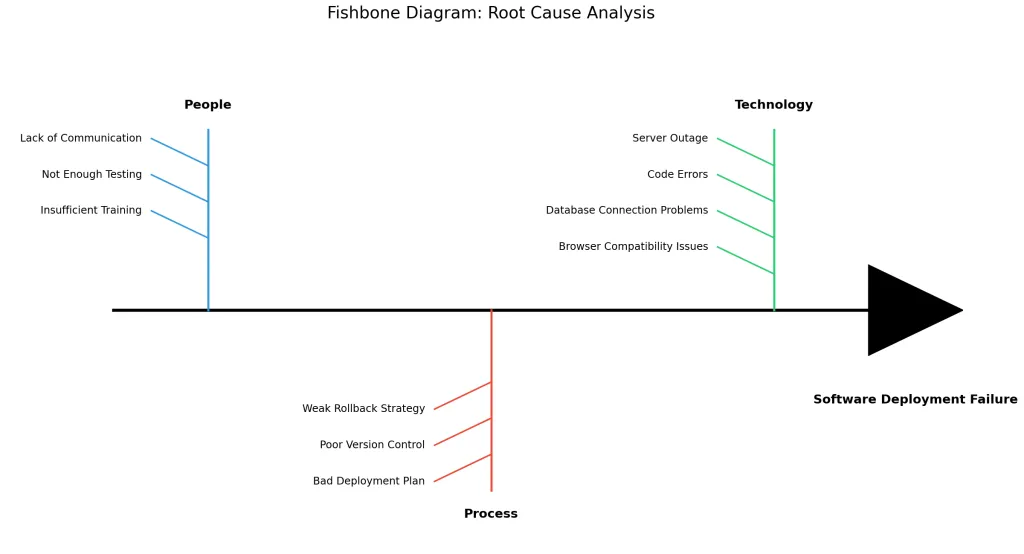
A failed website deployment can cause big problems and financial losses for companies. Let’s look at this situation using a fishbone diagram to find out what might be causing it:
Fishbone Diagram – Failed software Deployment.
| Category | Potential Causes |
|---|---|
| People | Lack of Communication, Not Enough Testing, Insufficient Training |
| Process | Bad Deployment Plan, Poor Version Control, Weak Rollback Strategy |
| Technology | Server Outage, Code Errors, Database Connection Problems, Browser Compatibility Issues |
By looking at each of these areas, businesses can figure out the main cause of a website deployment failure. For example, poor version control could be a key reason for these issues, prompting companies to create a better version control system.
Free Fishbone Diagram Generator- Python Script
Here is a python script i wrote to help you generate your own fishbone diagrame
`~~import matplotlib.pyplot as pltimport~~ ~~numpy~~ ~~as~~ ~~npfrom~~ ~~matplotlib~~.~~patches~~ ~~import~~ ~~Polygondef~~ ~~add_line_breaks~~(~~text~~, ~~words_per_line=4~~): ~~"""Add line breaks to text after specified number of words."""~~ ~~words~~ ~~=~~ ~~text~~.split() ~~lines~~ ~~=~~ [] ~~for~~ ~~i~~ ~~in~~ ~~range~~(~~0~~, ~~len~~(~~words~~), ~~words_per_line~~): ~~lines~~.~~append~~(~~' '~~.~~join~~(~~words~~[~~i~~:~~i+words_per_line~~])) ~~return~~ ~~'\n'~~.~~join~~(~~lines~~)~~def~~ ~~create_fishbone_diagram~~(~~problem~~, ~~categories~~): ~~""" Create a fishbone diagram with the given problem statement and categories of causes. Args: problem (str): The main problem to be analyzed categories (dict): Dictionary with categories as keys and lists of causes as values """~~ ~~# Setup figure~~ ~~fig~~, ~~ax~~ ~~=~~ ~~plt~~.~~subplots~~(~~figsize=~~(~~14~~, ~~8~~)) ~~# Set limits and turn off axes~~ ~~ax~~.~~set_xlim~~(~~0~~, ~~10~~) ~~ax~~.~~set_ylim~~(~~0~~, ~~6~~) ~~ax~~.~~axis~~(~~'off'~~) ~~# Draw the main spine (horizontal line)~~ ~~ax~~.~~plot~~([~~1~~, ~~9~~], [~~3~~, ~~3~~], ~~'k'~~, ~~linewidth=3~~) ~~# Draw the fishhead (arrow)~~ ~~head~~ ~~=~~ ~~Polygon~~([[~~9~~, ~~2.5~~], [~~10~~, ~~3~~], [~~9~~, ~~3.5~~]], ~~closed=True~~, ~~fill=True~~, ~~color='black'~~) ~~ax~~.~~add_patch~~(~~head~~) ~~# Add problem statement below the arrow with line breaks~~ ~~formatted_problem~~ ~~=~~ ~~add_line_breaks~~(~~problem~~) ~~ax~~.~~text~~(~~9.5~~, ~~2.0~~, ~~formatted_problem~~, ~~ha='center'~~, ~~va='center'~~, ~~color='black'~~, ~~fontweight='bold'~~, ~~fontsize=12~~) ~~# Calculate positions for categories~~ ~~num_categories~~ ~~=~~ ~~len~~(~~categories~~) ~~category_positions~~ ~~=~~ ~~np~~.~~linspace~~(~~2~~, ~~8~~, ~~num_categories~~) ~~# Colors for different categories~~ ~~colors~~ ~~=~~ [~~'#3498db'~~, ~~'#e74c3c'~~, ~~'#2ecc71'~~, ~~'#f39c12'~~, ~~'#9b59b6'~~, ~~'#1abc9c'~~] ~~for~~ ~~i~~, (~~category~~, ~~causes~~) ~~in~~ ~~enumerate~~(~~categories~~.items()): ~~# Get position for this category~~ ~~pos~~ ~~=~~ ~~category_positions~~[~~i~~] ~~color~~ ~~=~~ ~~colors~~[~~i~~ ~~%~~ ~~len~~(~~colors~~)] ~~# Draw branch line~~ ~~if~~ ~~i~~ ~~%~~ ~~2~~ ~~==~~ ~~0~~: ~~# Top branches~~ ~~ax~~.~~plot~~([~~pos~~, ~~pos~~], [~~3~~, ~~5~~], ~~color=color~~, ~~linewidth=2~~) ~~# Add category label~~ ~~ax~~.~~text~~(~~pos~~, ~~5.2~~, ~~category~~, ~~ha='center'~~, ~~va='bottom'~~, ~~fontweight='bold'~~, ~~fontsize=12~~) ~~# Add causes~~ ~~for~~ ~~j~~, ~~cause~~ ~~in~~ ~~enumerate~~(~~causes~~): ~~# Calculate position along the branch~~ ~~cause_pos~~ ~~=~~ ~~5~~ ~~-~~ (~~j+1~~) ~~*~~ ~~0.4~~ ~~# Draw small branch~~ ~~ax~~.~~plot~~([~~pos~~, ~~pos~~ ~~-~~ ~~0.6~~], [~~cause_pos~~, ~~cause_pos~~ ~~+~~ ~~0.3~~], ~~color=color~~, ~~linewidth=1.5~~) ~~# Add cause text with line breaks~~ ~~formatted_cause~~ ~~=~~ ~~add_line_breaks~~(~~cause~~) ~~ax~~.~~text~~(~~pos~~ ~~-~~ ~~0.7~~, ~~cause_pos~~ ~~+~~ ~~0.3~~, ~~formatted_cause~~, ~~ha='right'~~, ~~va='center'~~, ~~fontsize=10~~) ~~else~~: ~~# Bottom branches~~ ~~ax~~.~~plot~~([~~pos~~, ~~pos~~], [~~3~~, ~~1~~], ~~color=color~~, ~~linewidth=2~~) ~~# Add category label~~ ~~ax~~.~~text~~(~~pos~~, ~~0.8~~, ~~category~~, ~~ha='center'~~, ~~va='top'~~, ~~fontweight='bold'~~, ~~fontsize=12~~) ~~# Add causes~~ ~~for~~ ~~j~~, ~~cause~~ ~~in~~ ~~enumerate~~(~~causes~~): ~~# Calculate position along the branch~~ ~~cause_pos~~ ~~=~~ ~~1~~ ~~+~~ (~~j+1~~) ~~*~~ ~~0.4~~ ~~# Draw small branch~~ ~~ax~~.~~plot~~([~~pos~~, ~~pos~~ ~~-~~ ~~0.6~~], [~~cause_pos~~, ~~cause_pos~~ ~~-~~ ~~0.3~~], ~~color=color~~, ~~linewidth=1.5~~) ~~# Add cause text with line breaks~~ ~~formatted_cause~~ ~~=~~ ~~add_line_breaks~~(~~cause~~) ~~ax~~.~~text~~(~~pos~~ ~~-~~ ~~0.7~~, ~~cause_pos~~ ~~-~~ ~~0.3~~, ~~formatted_cause~~, ~~ha='right'~~, ~~va='center'~~, ~~fontsize=10~~) ~~# Add title with problem statement~~ ~~ax~~.~~set_title~~(~~f'Fishbone Diagram: {problem}'~~, ~~fontsize=16~~, ~~pad=20~~) ~~# Create filename with underscores instead of spaces~~ ~~filename~~ ~~=~~ ~~problem~~.replace(~~' '~~, ~~'_'~~) ~~+~~ ~~'.png'~~ ~~# Show the diagram~~ ~~plt~~.~~tight_layout~~() ~~plt~~.~~savefig~~(~~filename~~, ~~dpi=300~~, ~~bbox_inches='tight'~~) ~~plt~~.~~show~~()~~# Sample data from the tableproblem_statement~~ ~~=~~ ~~"Increased Patient Complaints about Scheduling Appointments"# Example data based on the imagecategories~~ ~~=~~ { ~~"Staffing"~~: [ ~~"Insufficient staff"~~, ~~"Not trained"~~, ~~"Unable to access tool"~~ ], ~~"Technology"~~: [ ~~"Appointment system does not work"~~, ~~"Temporary outages"~~, ~~"Unable to access on mobile"~~ ], ~~"Communication"~~: [ ~~"Unclear communication between staff and patient"~~, ~~"Patient isn't aware of system"~~ ], ~~"Procedures"~~: [ ~~"Poor scheduling practices"~~, ~~"Lack of accountability"~~, ~~"No RACI"~~ ]}~~# Create the diagramcreate_fishbone_diagram~~(~~problem_statement~~, ~~categories~~)`
Conclusion
In conclusion, learning how to use root cause analysis with fishbone diagrams is an important skill. It can help many industries a lot. By finding problem areas and listing potential causes, businesses can work better, reduce downtime, and improve the quality of services. Fishbone diagrams give a clear method to understand complex issues, leading to good solutions. Real-life examples show how this tool can help with issues like website problems or getting traction for product features. Using the fishbone diagram method helps businesses find and fix root causes. This promotes continuous improvement and success in many sectors.
Frequently Asked Questions
What makes a fishbone diagram an effective tool for root cause analysis?
A Fishbone Diagram is a useful tool for finding the root cause of a problem. Its clear and organized format helps teams think of and sort out possible causes related to a specific issue. This step-by-step method allows for a full analysis and helps find the powerful root cause instead of just looking at the symptoms.
Can fishbone diagrams be applied to any industry or are they specific to manufacturing?
100 % YES! The Fishbone Diagram came out of manufacturing, but is always useful, especially in techniques like Six Sigma.
 Part 06 of 07
 Picking Speakers Without Picking Favorites
In an eight-person standup the same two people speak every day. In a sixteen-person oncall rotation the same four take 80% of the pages. The fix isn't 'let's be more inclusive' — it's making the picking mechanical so the loudest voice and the manager's habits stop deciding. I built a wheel-spinner called Fate Games. The fairness story turned out to be one specific algorithm — a depleting pool — and the choice to lean all the way into the snark.
A friend runs an eight-person engineering team. The same two engineers spoke in every standup. The same one volunteered for every oncall shift. The same three ran every demo. He'd noticed, mentioned it twice in retros, the team agreed it was a problem — and nothing changed. He asked me if I'd build him "something dumb, like a wheel-spin thing" to take the picking out of his hands.
I built it. The whole project is called Fate Games and the picker at its heart is the Wheel of Death. The tagline is "No volunteers needed." If that sounds harsher than the problem it solves, keep reading — the framing turns out to be load-bearing, in the opposite direction you'd expect.
The thing that doesn't work: "let's be more inclusive"
The "soft" fix — say in the retro that everyone should speak more, ask quieter people directly — works for one or two meetings and then drifts back. It drifts back because the underlying selection mechanism hasn't changed. Whoever speaks first still wins. Whoever's top-of-mind for the lead still gets the work. Over weeks the gap compounds.
The harder fix is to take the human out of the picking for the picks that should rotate fairly. Standup report-outs. Oncall shifts. Who runs the demo. Who facilitates retro. None of those needs a manager's judgment call — they need a rotation that doesn't forget anyone.
That's a one-page app. I built it in an afternoon. Then I spent another afternoon getting the fairness mechanism right, because the obvious implementation is wrong in a way that's hard to see until you do the math.
Pure random isn't fair
When you read "random," your gut reaches for Math.random() * users.length. That picks a person, independently, every spin.
That's wrong for this use case.
In an 8-person group, pure random across 8 spins:
- The probability that everyone gets picked once is
8! / 8^8≈ 0.24%. - The probability that at least one person is skipped is therefore ≈ 99.76%.
- The expected number of distinct people picked is
8 · (1 - (7/8)^8)≈ 5.27.
That last number is the one I keep coming back to. With pure random, you'd expect about three of your eight people to not have spoken at all after a week of daily standups, while one or two have gone twice. That's not "fair with some variance" — that's worse than the manager's habits, because the manager at least notices that Eddie hasn't reported in a week. The dice don't.
A second-order problem makes it actually worse: streaks feel personal. The person who gets picked three times in a row stops trusting the wheel. The person who hasn't been picked in two weeks stops paying attention to standup. The mechanism that was supposed to take the favoritism out of the picking creates a new, less defensible flavor of it.
The fix: a depleting pool
The mechanism that actually works is a queue that empties:
- Start with all
Npeople in the pool. - On each spin, pick uniformly at random from the pool (not from the full group).
- Remove the picked person from the pool.
- When the pool is empty, refill it.
Properties:
- Guaranteed coverage. Every
Nspins, everyone has gone exactly once. No skips, no doubles, no compounding gaps. - Still random within the round. The order inside each round of
Nis unpredictable, so it doesn't feel like a deterministic rota. - Self-correcting after team changes. Add a person mid-week; they show up in the next pool refill. Remove a person; the pool shrinks. No special-case logic.
This is the same shape as a card deck that gets shuffled and dealt down, then reshuffled when empty. Programmers know this as a Fisher-Yates draw without replacement. Statisticians call it sampling without replacement, with repeated rounds. Kids dividing teams on a playground call it "everyone goes before anyone goes again."
In code it's maybe twenty lines. The version in Fate Games stores the pool in localStorage per {teamId}:challenge:{challengeId} so the same team can have a separate rotation for standup, oncall, and demo-running, each with its own depleting state. When the pool empties, the next spin reseeds from the full team.
That's the whole algorithm. The hard part isn't the math — it's making sure the user feels like the wheel is fair while the wheel does its work.
The Wheel of Death — and why the snark is the product
This is where Fate Games diverges from every "team picker" tool I'd looked at while building it. The polite ones — "team randomizer," "fair rotation widget," "spinning wheel" — all reassure you that being picked is fine, that the algorithm is fair, that nothing personal is happening. They are all read by users as exactly what they are: managerial tools designed to soften an awkward moment.
The thing my friend's team was actually doing in standup wasn't avoiding speaking. It was being polite about whose turn it was. "Oh, you go," "no you go," "no really, I went last time" — that's the loop the wheel had to break. The polite framing was the thing keeping the same two people speaking every day, because the polite framing made being picked feel like being chosen against you.
So I went the other way. The picker is the Wheel of Death. It glows orange, makes a satisfying clack, and lands on you with a skull-and-crossbones celebration. When you get picked, the headline doesn't say "You've been selected to share an update" — it says "Spin to die!"
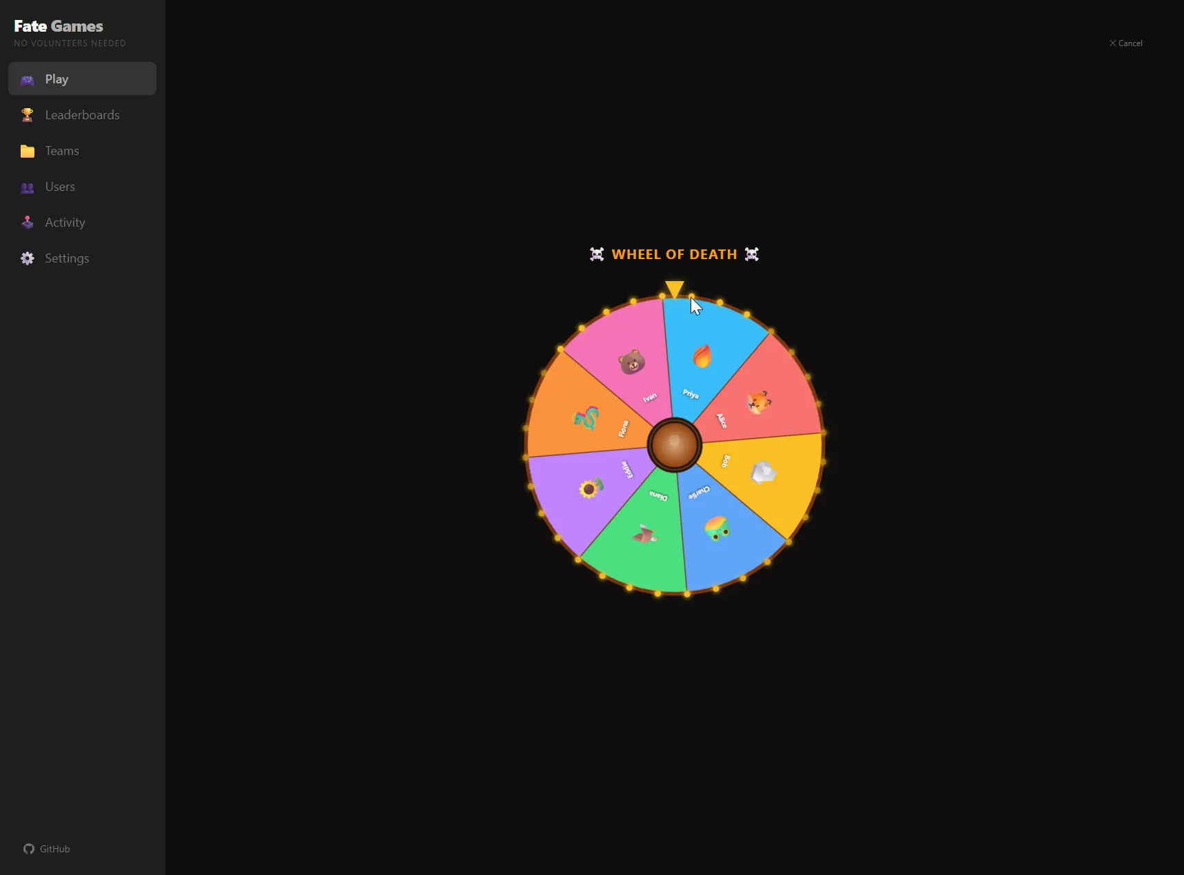
It feels worse than "team randomizer." It works better. Two reasons:
One — humor lowers the social cost of being picked. When the wheel says "Spin to die!" and lands on you with a skull, you have a script. You laugh. You go. The polite framing leaves you with no script except "uh, I guess it's me?" — which is the exact pause the room used to fill with "no no no, you go." The snark turns the moment into a bit, and the bit doesn't need consensus.
Two — being picked stops being a status thing. A team-randomizer that tries to be respectful implicitly says "being picked is an honor / responsibility / promotion." Wheel of Death says "you got eaten by a T-Rex" (one of the other games is literally called T-Rex Pit). The picker doesn't claim it's fair-in-a-noble-sense; it claims it's fair-in-a-doesn't-care sense. Quieter people I'd shown this to read that as a relief — the picker doesn't think being picked is a big deal, so they don't have to either.

The "no volunteers needed" tagline is the same move. It's not telling users that volunteering is bad. It's reassuring them that they don't have to perform willingness. That performance is what the polite framing was extracting from them every standup.
Make the rotation auditable
The depleting pool is invisible to the user mid-spin — they see a wheel, they see a name, they see a skull. Over a week of standups, the question stops being "is this spin fair?" and starts being "am I being picked more than my share?" That deserves a real answer, not a vibe.
The Leaderboards page keeps a running count per person across all rotations they're in:
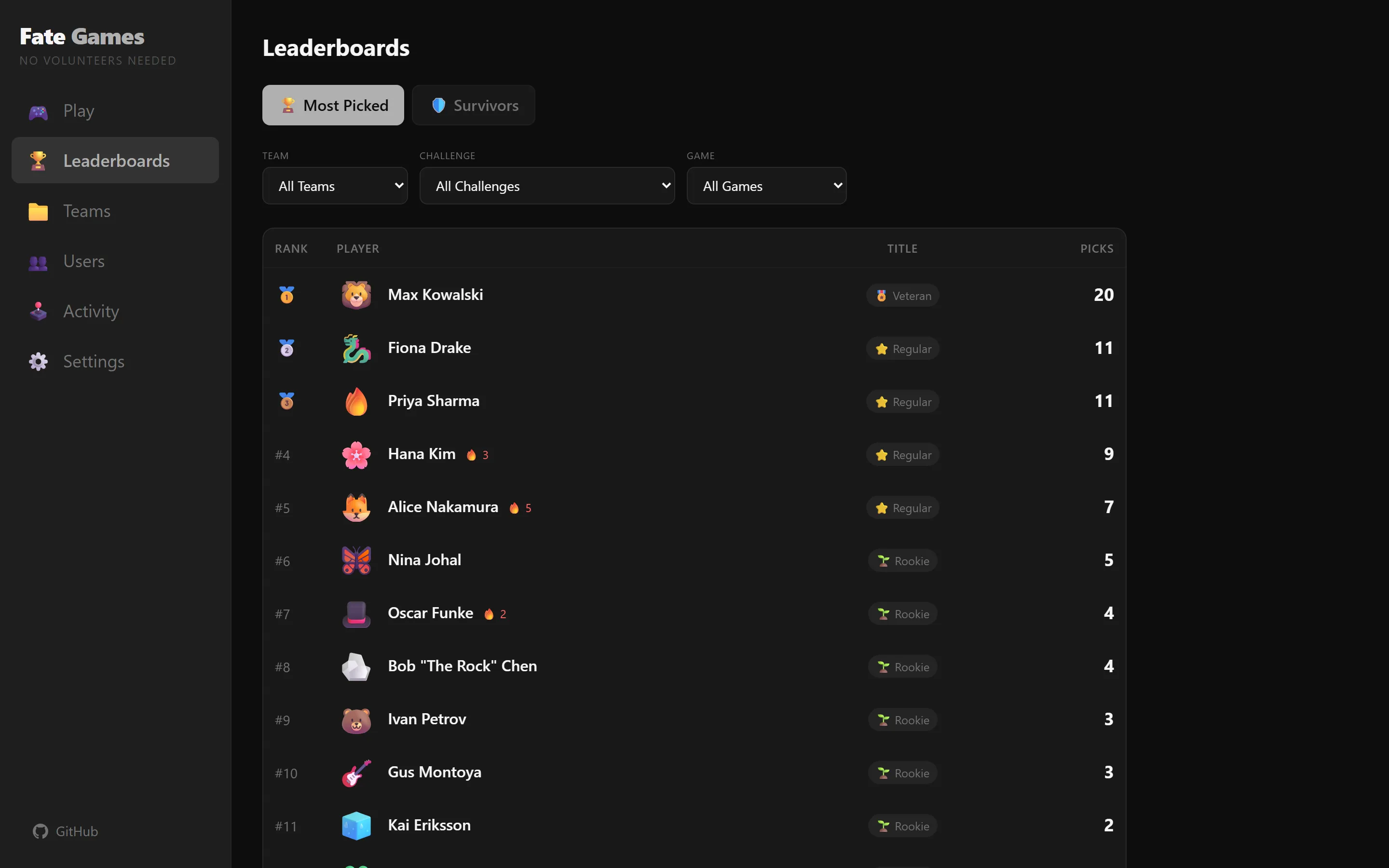
Two things land in this view that I didn't plan and ended up keeping:
- Gamification titles — Fresh Meat (0 picks), Rookie (1+), Regular (6+), Veteran (16+), Legend (31+), Immortal (51+). I added them as a joke. They turned out to be the thing people actually look at — "oh I'm finally a Regular" — which is exactly the wrong incentive for a fair rotation tool and exactly the right one for getting people to keep using it.
- Filter by team / challenge / game — once one team had three rotations going (standup, oncall, demo-running), the question shifted from "who got picked" to "who got picked for what." The filters let a manager answer that in two clicks. The answer is almost always "the math is fine, your memory is biased."
A subtle anti-pattern I avoided: the first version had a "Streaks" tab. Looked great. The problem was that streak data invites celebration — "Diana is on a 4-day streak!" — which is exactly the framing the tool is supposed to kill. Got rid of it. The app is for picking fairly, not for gamifying speaking up.
What didn't work — the stuff that's not in the screenshots
A few things I tried and pulled back:
- A longer, more dramatic spin animation with sound effects. Looked great in isolation. In a standup it became the bit, and the bit took the meeting hostage — every spin felt like Wheel of Fortune. Wound it back to a ~3 second total animation that lands cleanly. A picker that takes 8 seconds per pick eats 64 seconds of standup time in an 8-person team. Not free.
- An "exempt" toggle to skip someone (out sick, traveling). Built it, removed it. The depleting pool is forgiving — if you can't speak today, the round just continues without you and you're up first next round. Adding an exempt UI created the very gap-tracking workload the tool was meant to eliminate.
- Server-side state. Started writing it. Killed it.
localStorageis the right answer for a tool one person runs in their browser to pick a name; a server adds account management, sync conflicts, hosting cost, and a privacy story to maintain — for zero functional benefit at the team-of-one scale.
The app is about 35 React components, no backend. The whole thing fits on a phone screen. The build pipeline runs locally; it deploys as static HTML.
What I'd tell a team adopting this
Three things.
First — the algorithm is non-negotiable, the UI is everything. Whichever picker your team uses (this one, a Slack bot, a paper hat), the depleting pool is the right mechanism for rotation work. The reason "pull a name from a hat without putting it back" exists in every culture is because every culture rediscovered the same math. Use that. But also: pick the tool whose voice matches your team's. Wheel of Death works because my friend's team has dark humor; on a team with different dynamics the same algorithm wrapped in different copy would be the right call.
Second — pick what to put in the rotation deliberately. Standup report-outs, demo-running, retro-facilitating, low-stakes meeting moderation: yes. Oncall: usually yes, but watch for skill gaps (a junior in week 2 doesn't take Sunday-night production pages alone — that's not fairness, that's negligence). Project lead, performance review, hiring loops: no — those want a manager's judgment, not a wheel. Build a different rotation per use case so you don't accidentally rotate the wrong thing.
Third — declare bankruptcy on the past. Don't load six months of standup history into the tool and try to "rebalance." Start the pool fresh on a Monday, tell the team that's what you're doing, and let the math handle it from there. Trying to compensate for past unfairness with current unfairness compounds the problem you started with.
Run it
The repo is at github.com/drlukeangel/fate-games. It's the early version — one team, the Wheel of Death, a slot machine I added because I couldn't help myself, and the depleting pool. Everything lives in browser localStorage. No signup. No telemetry. Reset clears it.
The math is the math. The skull is on purpose.
What's next
The next post in this notebook is on the inverse problem — when a decision genuinely needs a manager's judgment, and a fair rotation would be the wrong answer. Promotions, project lead assignments, deciding who takes a customer-facing escalation. The wheel knows when to spin; the harder skill is knowing when not to.
 Part 07 of 07
 Fate Games at Town-Hall Scale: The Grand Prix
What started as a snarky wheel-spinner for one team's standup ended up on a company VM, then in three different teams' rotations, then on the VP's monitor at an all-hands with 200 people in the room. The wheel maxes out around 12. The Race Game I'd built as a joke turned into a heat-tournament — Grand Prix — that scales to whatever the room is. Today I'm putting it on the projects page and open-sourcing it.
Two months ago I wrote about building a wheel-spinner called Fate Games for one engineering team's standup problem. The pitch was the depleting pool: everyone gets picked once before anyone repeats. The shape of the wheel was a single team of eight, the Wheel of Death, and a hard rule that the picker stays on one person's laptop in localStorage.
The tool slid out of that scope in three steps. None of them were planned. One of them got it onto the VP's screen at a 200-person all-hands. Here's how that happened and what the math looks like at that scale.
Step 1 — multi-team, because three people asked
The first request was from the SRE lead: "can our oncall rotation use this too?" Sure. The data model already had a Group type — internally it was always "groups of users with a depleting pool" — I just hadn't surfaced a second one. Added a Teams admin page, dropped the user-export to CSV, and pointed three different rotations at the same browser:
- Engineering — standup speaker
- SRE / Platform Ops — Sunday oncall
- Design & UX — demo-running
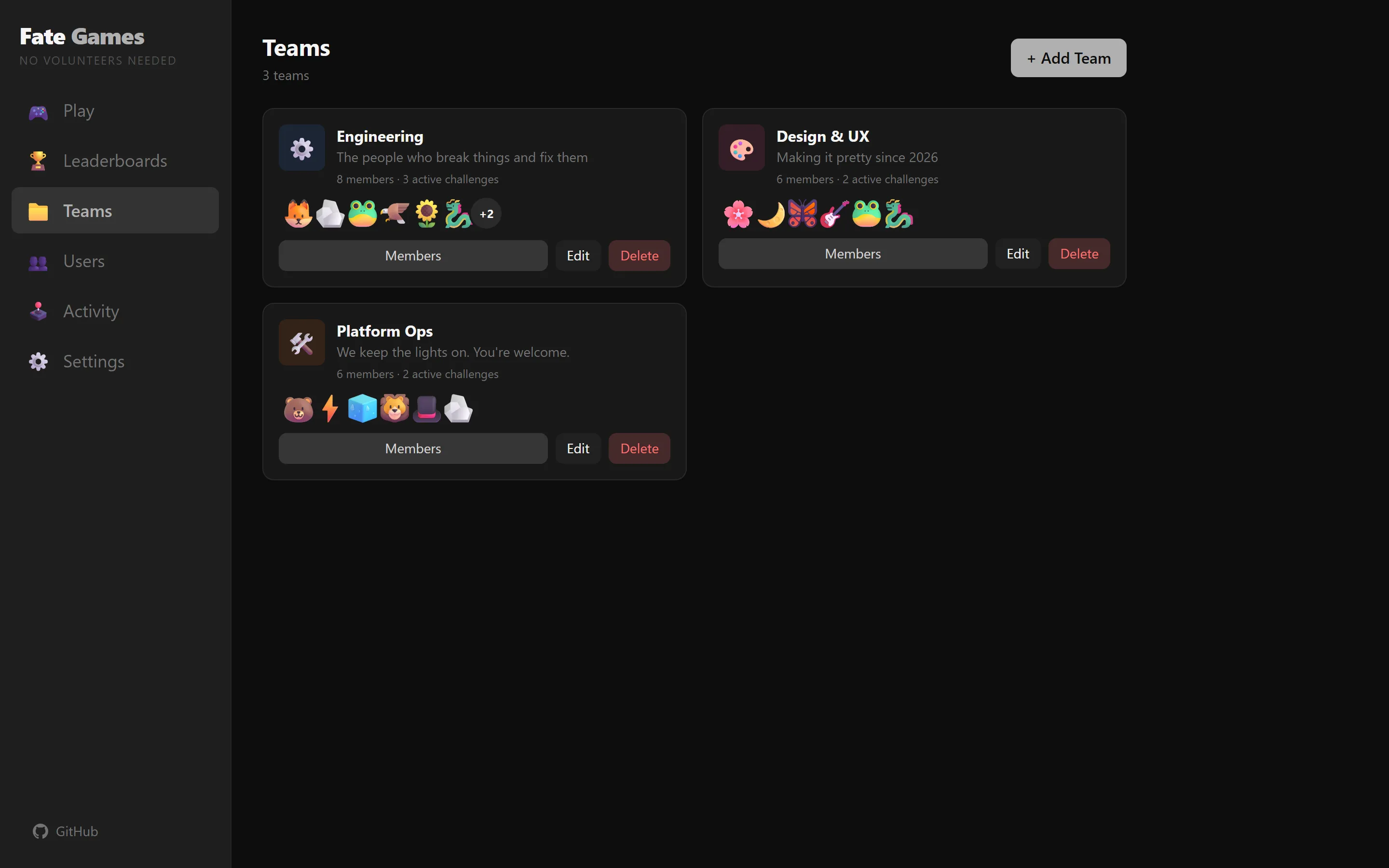
The pool key changed from {userId} to {teamId}:challenge:{challengeId} so each team's rotations stayed isolated. Adding the SRE team didn't reshuffle the Engineering pool, and adding a new challenge inside SRE — say, "Friday post-mortem facilitator" — didn't perturb the oncall rotation either. Each rotation is its own deck.
That was a one-evening change and I thought I was done.
Step 2 — onto a VM, because localStorage doesn't sync
What I hadn't reckoned with: the SRE lead and his manager wanted to both spin the wheel for oncall during the same standup. One on a laptop, one on a TV cast from a phone. Both needed to see the same pool state. localStorage is per-browser. Two browsers, two pools, two outcomes — they spun for the same shift twice and got two different people. That's not just unfair; that's a bug that erodes the trust the whole point of the tool depends on.
I had three options:
- Add a backend. Real database, auth, sync. Real maintenance forever.
- Use URL state. Encode the entire pool in the query string and let two browsers share a link. Works for a small team, falls apart fast.
- One canonical browser. Run the app in one place, share the screen.
Option 3 won, with a small change: I packaged the static build into an nginx container and asked our IT team if I could squat on a VM. They said yes — it's a single static React bundle, no surface area to defend, and the only state is in that VM's browser when someone visits. I sent the URL to the SRE lead, he opened it on the standup TV every morning, his team watched the wheel, and the question of "who did it pick" went away. The image is on the repo as a one-line Dockerfile + nginx config; the deploy was docker build && scp && docker run and took an afternoon.
If the team grew past two-browser coordination problems, I'd revisit. They haven't.
Step 3 — more games, because the wheel got boring
Once three teams used it daily, the wheel started to feel like a coin flip with extra steps. The team that had laughed at the skull on day one had laughed at the same skull every day for six weeks. Familiarity made the bit invisible.
So I added more games. All of them produce the same result — the depleting pool picks a winner, the animation is cosmetic — but each frames the moment differently:
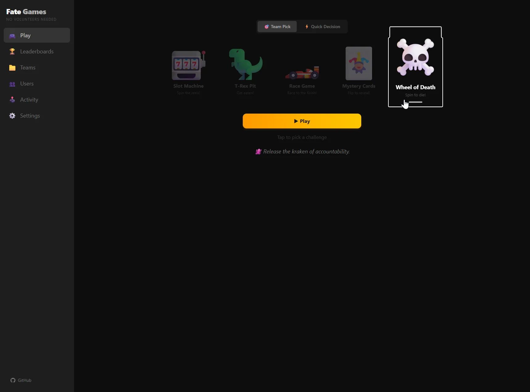
- Slot Machine — three reels, the middle one stops on the winner. Plays well right after coffee.
- T-Rex Pit — a tiny T-Rex animation eats the winner. The teenage-dirtbag energy of this one is somehow the morale-booster on Mondays.
- Race Game — emoji racers in lanes, finish line, winner pulls ahead in the last 20%. The one that ended up scaling to town halls — more on that in a minute.
- Mystery Cards — flip-card reveal. The "what's on this airline tray" energy. Goes over surprisingly well with finance, who don't want a skull on the screen during their standup.
- Wheel of Death — the original, still the workhorse.
The games rotate per challenge, so the same standup doesn't see the same animation two days running. And I added the gamification titles I'd built as a joke — Fresh Meat → Rookie → Regular → Veteran → Legend → Immortal — because the teams kept asking when they'd graduate.
Step 4 — Quick Decision, because the wheel kept getting borrowed for stuff it wasn't built for
The other thing the teams started doing — and it took me a while to notice — was running the wheel on things that weren't team rotations. "Where should we order lunch from?" "Whose meme makes it into the deck?" "Should I add this to my LinkedIn?" People were creating fake "teams" with three options as the "members" just to use the spinner for a yes/no.
I added a Quick Decision mode: no team, no rotation, just paste in 2–10 options and let the picker pick. Same five animations, but the depleting pool is disabled — pure random, because there's no fairness story to track for "tacos vs pizza."
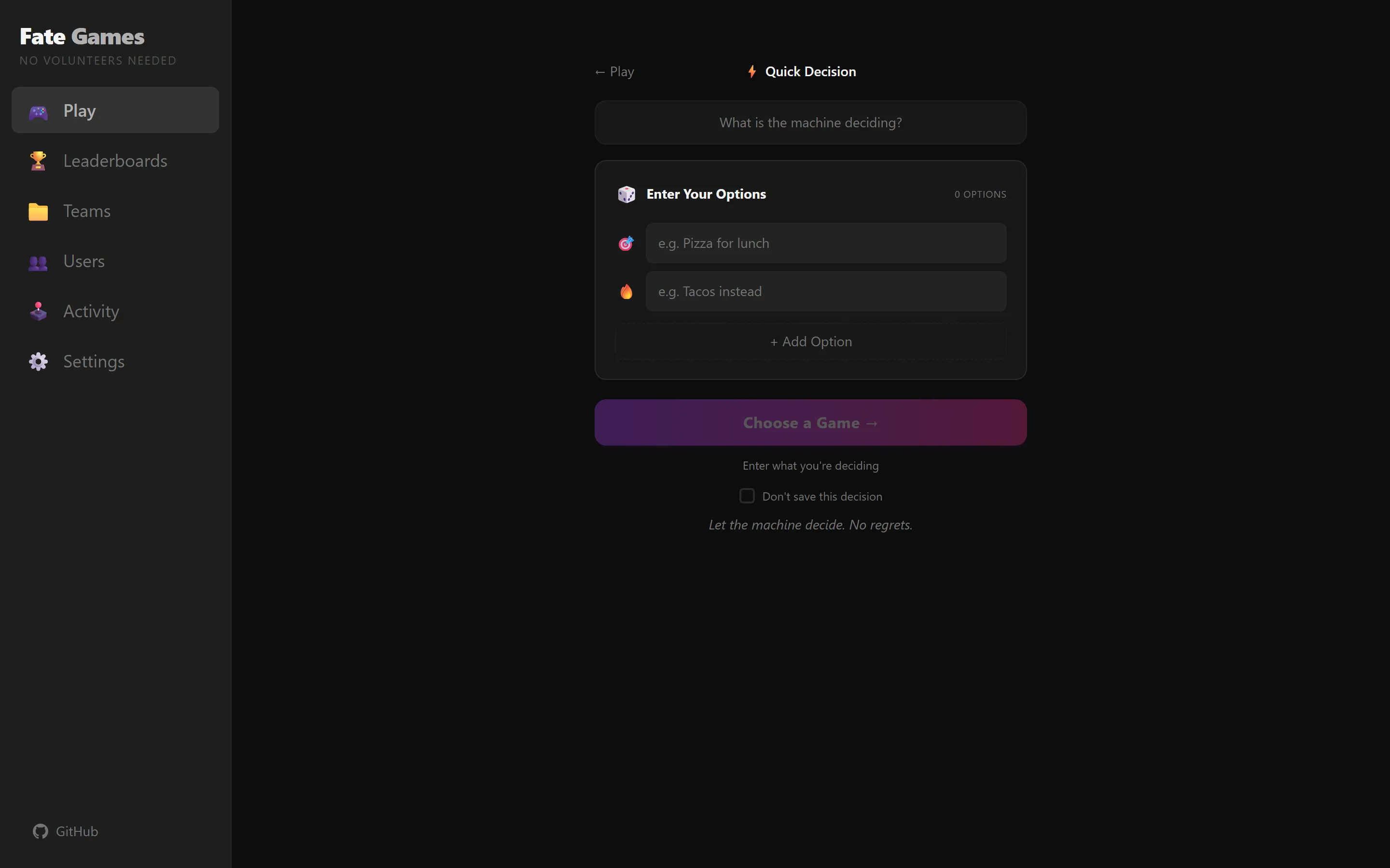
This is where the snark started writing itself. Real picks from the Activity log: "What do I bring to the potluck → Audacity." "Can I expense this → Ask forgiveness not permission." "Should I add this to my LinkedIn → Only if you call yourself a thought leader." The decisions persist in the same auditable feed as the team picks, so the next standup can scroll back through "what did we decide about lunch last week" and have a real answer.
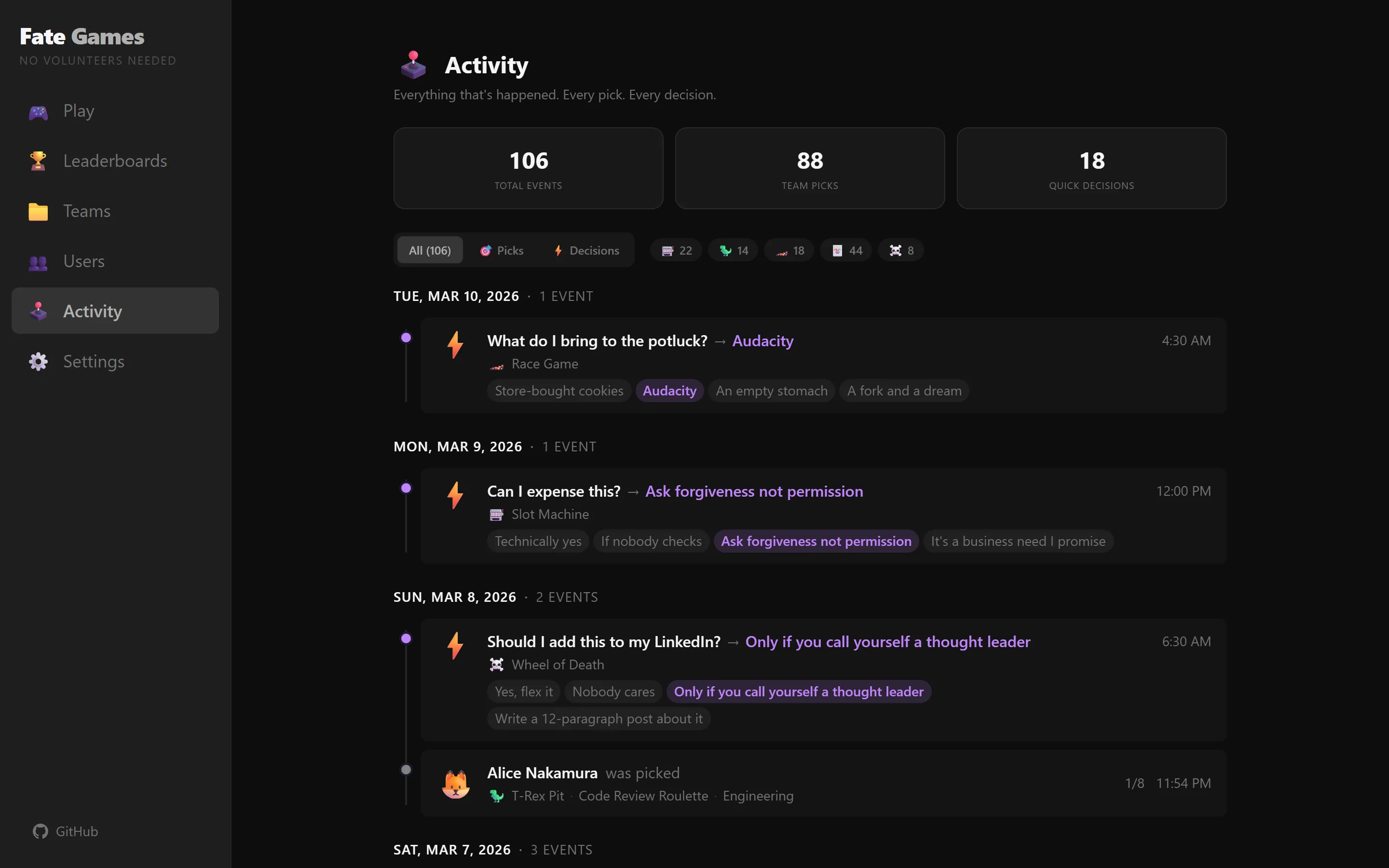
The Activity page is now the most-visited screen in the app, which surprised me — I'd built it as a debugging view.
Step 5 — the VP, the town hall, and the wheel that doesn't scale
This is the one I want to spend the most time on, because the math is genuinely interesting.
The VP had seen Fate Games on the standup TV, watched a couple of spins, asked what it was, and at the next all-hands wanted to use it to pick the team that would lead the next quarter's tiger team. Two hundred people in the room. One winner.
I tried it on a test pool of 200 names. The Wheel of Death does not work at 200.
The wheel's failure mode is geometric: at 8 segments each slice is 45°, which the eye can read. At 50 segments each slice is 7.2°, which is half the width of the pointer arrow. At 200 segments each slice is 1.8° — thinner than the line that draws it. The animation runs, the wheel slows, the pointer lands on something, and there is no possible way for anyone in the room to verify that the visual selection matches the algorithm's selection. The fairness story disappears even though the math is still correct.
The Slot Machine had a similar problem — three reels with 200 entries each is a 600-row scroll, and you can't read the middle reel as it spins. T-Rex Pit and Mystery Cards both topped out around 20 candidates. None of the cosmetic games scaled.
The Race Game was the surprise. It had a hard 10-lane cap (I'd written one too many CSS animations and stopped at 10). For the town hall I needed to extend it. The thing I ended up with is not a bigger race — it's a tournament.
The Grand Prix — a heat tournament for arbitrarily many candidates
The rule is simple. If the candidate pool is ≤10, run a single race. If it's >10, split into heats of 10, run the heats sequentially, advance each heat winner to a "Finalists" row, and when all heats are done run a final race among the finalists.
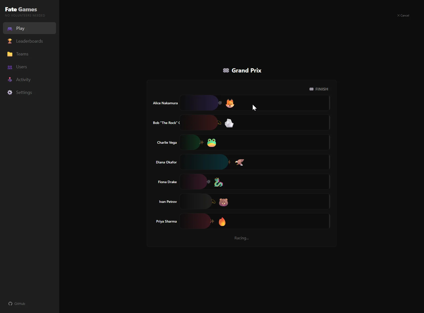
The math:
- 20 candidates → 2 heats of 10 → 1 final of 2 → 3 races total
- 50 candidates → 5 heats of 10 → 1 final of 5 → 6 races total
- 200 candidates → 20 heats of 10 → 1 final of 20 → 21 races total
Each heat runs at 1.5× speed (so the audience isn't sitting through twenty identical 10-second races at 200 people) and the final runs at normal speed for drama. At 200, the whole tournament finishes in about 3 minutes — long enough to feel like the event it's deciding, short enough that the room doesn't get bored.
What stays correct mathematically: the predetermined winner — picked by the depleting pool (or pure random if we're picking from the whole company) before the first heat even starts — wins their heat and then wins the final. The other racers in each heat lose to a seeded speed curve that I built with random "burst points" so the same person can come from behind one race and lead wire-to-wire the next. Every racer in a heat the predetermined winner is not in has their own random winner — but those people can't be the overall winner, by construction, because they don't make it to the final.
What stays correct experientially: the room sees twenty heat-winners (the screenshot above shows the finalists accumulating as emoji pills above the track) before the final. That accumulation is the trust scaffolding the wheel lost at 200 segments. You can see the bracket narrowing. The final feels earned because it visibly is.
The framing also changed. The VP didn't introduce it as "we're going to randomly pick a tiger team lead." He introduced it as the Grand Prix. People who'd been polite about the wheel — "oh, I don't need to be in the running" — wanted to be in their heat. The competitive frame turned getting picked from "uncomfortable singling-out" to "I almost made the final." Same algorithm. Different social contract.
The team that won the Grand Prix in that town hall ran the tiger team. They had a great quarter. None of them volunteered.
What didn't work — the stuff I cut at scale
- Letting the audience vote on the seed. Tried a thing where the room could pick which emoji icon belonged to which heat. Took six minutes to set up. Killed the pacing. Everyone forgot which emoji was theirs. Cut it.
- Streaming the wheel to remote employees. Tried sending the URL to the all-hands Zoom feed; the animation jittered at 15fps in the screen-share and people in the chat thought it was rigged. For remote-heavy town halls the wheel needs to render in each viewer's browser off a synced clock — that's a real backend project I haven't done and may not.
- A persistent "Grand Prix history" page. Two days of design later I realized this was the streaks page I'd cut in the v1 dressed up in a tournament costume. Same anti-pattern: it would invite celebrating who-keeps-winning. Cut.
We're open-sourcing it
That brings me to today. The repo at github.com/drlukeangel/fate-games was always public — what's new today is that I'm putting it on the projects page and writing it up properly. It's React 19 + Vite + Tailwind v4 + Zustand for state, MIT-licensed, a Dockerfile if you want to host it on a VM the way our SRE team does. There's no SaaS to sign up for; clone it, run it, host it however you like.
If you want to try the Grand Prix without cloning anything, the live demo is at drlukeangel.github.io/fate-games with the seed dataset of 16 fake employees across three teams. Hit the Race Game with all three teams selected and you'll get a 20-candidate Grand Prix. (Add 200 more users via the admin if you want to see what the VP saw.)
What I'd tell a team adopting this at scale
Three things, again.
First — the cosmetic game has to match the social contract you want. Standup picker → Wheel of Death is fine because the team has dark humor and the moment is low stakes. Town-hall tournament → Grand Prix is fine because the heat structure creates earned-ness. Performance-review draw → none of these is fine; you shouldn't be picking with a wheel.
Second — auditability is the price of skipping a backend. The activity feed is the only reason no one has accused the wheel of being rigged. Every pick is in there, with timestamp, candidate set, and game type. The first complaint I got after multi-team rolled out was "the wheel picked me twice yesterday"; the activity feed showed it had picked them once and they were misremembering. That conversation took 90 seconds. Without the feed it would have been a meeting.
Third — the Grand Prix is the upper bound of how many people a single static site can fairly pick from in a way the room trusts. If you need to pick from 2,000 people in a way that all 2,000 can independently verify, you need a backend, a cryptographic commit-reveal, and a different blog post. For one person spinning a wheel on a TV in a room with 200 people, the heat tournament does the job.
What's next
The next post in this notebook is about the inverse problem I promised two months ago — when a decision genuinely needs a manager's judgment and a rotation is the wrong tool. Promotions, project leads, the customer-facing escalation. The wheel knows when to spin; the harder skill is knowing when not to.